Writer: Vicki L. Ingham
The color that usually evokes dreariness, boredom and ambiguity suddenly took on positive and comforting connotations with the Great Recession.
It was “a color of balance, a sensible color,” Mark Woodman of the Color Marketing Group (CMG) said in a phone interview. CMG is a not-for-profit international association headquartered in Alexandria, Virginia, that identifies color trends. “In times of crisis, whether financial or political, we want something stable that plays well with others, and gray does that.”
The CMG sees gray continuing to be an interior design staple, evolving toward charcoal tones and staying fresh through layering lighter tones with texture.
Working with gray can be tricky, though, local interior designers agree. “It takes experience to determine whether the undertone is warm or cool,” says interior designer Rebecca Cartwright of R. Cartwright Design.
And the undertone is key to choosing all the other colors for a room. Cartwright relies on Benjamin Moore Revere Pewter and Edgecomb Gray for the walls in most of her gray schemes. “They are good chameleons,” she says. “They work well with both warm and cool tones,” which makes them a flexible background for other colors.
In the following series of images, see how Cartwright and Meghan Blum of Meghan Blum Interiors have used gray to create inviting, sophisticated interiors.
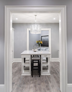
The gray scheme for this multipurpose room next to the laundry in an Ankeny home started with the distressed hardwood floors, which were stained a cool gray. Blum chose a cool version for the walls (Benjamin Moore Gray Huskie) and accented them with warm white trim and furniture. A touch of black—in the stool legs—keeps the space from feeling bland. Flowers and art are also easy ways to add color in a neutral room, Blum says.
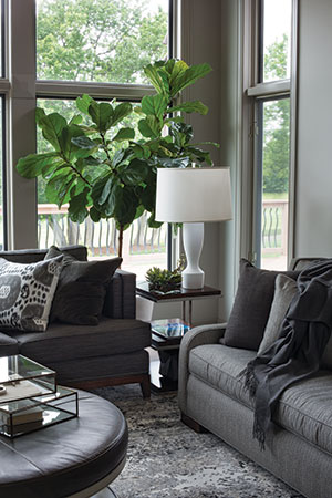
To make sure your grays live well together in both natural and artificial light, Cartwright says it’s essential to look at fabric and paint swatches in natural light before choosing. “Artificial light, whether LED or incandescent, can pull gray to [either] the warmer or cooler side,” throwing your scheme off balance. She advises using LEDs of less than 3000 lumens to more closely imitate natural sunlight indoors. Cartwright also points out that small doses of color have a powerful impact on gray schemes. In this West Des Moines living room, a green plant adds color and life.
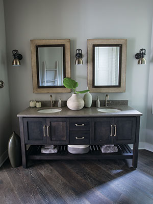
Layering finishes makes gray-on-gray more interesting, Cartwright says. With Edgecomb Gray on the walls and a dark gray stain on the vanity, the designer selected a palette of warm-toned finishes to correspond with the warmth of the cerused (limed or whitened) oak floors: gold and silver leaf on the mirror frames, a quartz countertop the color of concrete, antiqued stainless steel and bronze sconces, and hand-forged hardware on the vanity.
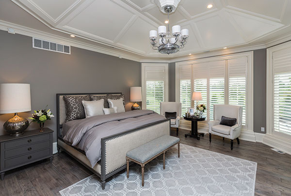
Blum uses a range of tones, from warm white to silver and charcoal gray, to give a gray-on-gray scheme depth and punch. “It’s also important to layer different textures and different sheens to create depth in the room,” she says.


