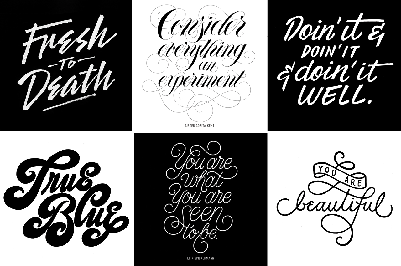
Above: In all her artwork, sampled above, Anna Frederick considers the weight, slant and spacing of each line. Even the smallest elements of style can amplify or diminish the meaning of the words.
Writer: Michael Morain
Photographer: Karla Conrad
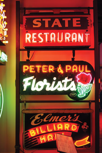
While drivers race up and down East 14th Street, Anna Frederick stands on a corner at the north edge of Grand View University and admires a fading sign on a low brick building. Its hand-painted letters march across a dozen rusty tiles to spell THRASHER’S HARDWARE.
She points out the script’s tidy corners and even proportions. “The balance between positive and negative space is huge, huge, huge, huge, huge,” she says. “Whoever did this knew what they were doing.”
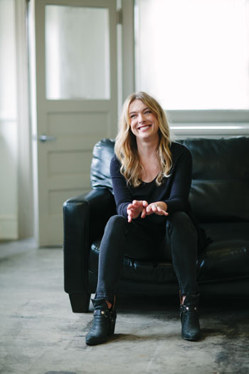
Frederick (whose first name rhymes with “Donna,” not “banana”) knows what she’s doing, too—or at least she’s figuring it out fast. At 34, she is part of a new generation of sign painters who are reviving an art form that computers and vinyl-cutting machines almost wiped out in the 1980s. She jumped full time into the lettering and logo business just last fall, but her handiwork is already popping up around town.
You know it when you see it: at the Paramount Barbering Co. sign in the East Village. On two covers of Midwest Living. On one of the giant golf-ball sculptures for the Solheim Cup.
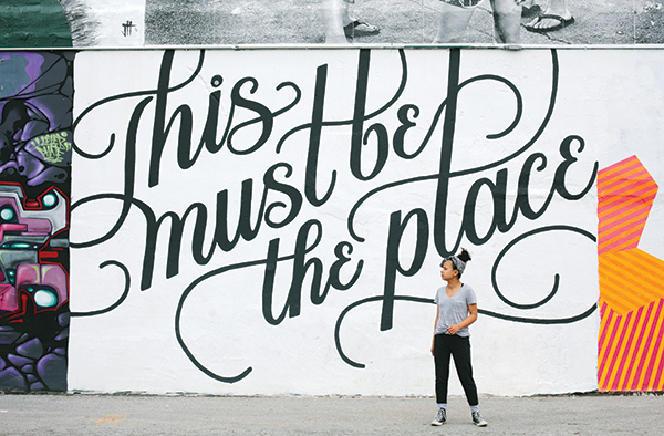
And of course, on the side of RoCA, the restaurant on Court Avenue. She painted the swooping cursive “This must be the place” mural over Memorial Day weekend in 2015; since then, it’s shown up in countless selfies on Instagram and Facebook. Prom dates pose in front of it. Couples get engaged there.
 Once, when Frederick strolled past the mural during the farmers market, a pair of strangers asked her to take their picture there. She did, without explaining her connection to the work.
“I wish I’d signed it,” she said during a visit to the site in June, when two different clusters of teenagers snapped photos even as she and I chatted in the parking lot.
It was a hot, gusty evening, and Frederick wore cut-offs and a black T-shirt emblazoned with no-nonsense white capitals: ARTISTS RUN THE STREETS. As if to prove it, we hopped into her battered gray Saturn to see some of her favorite hand-painted signs: the one at Thrasher’s, plus other vintage specimens at the former Northwestern Hotel in the East Village, the Bellizzi-MacRae American Legion on the south side, and pretty much everywhere you look in Valley Junction.
“There are things like this all over town,” she said. “I just love them.”
Frederick has always loved letters, in fact. Growing up in Des Moines, she filled her school notebooks with doodled calligraphy and went on to study marketing and graphic design at Simpson College. But it wasn’t until a few years ago, when she was painting signs part time at Trader Joe’s, that she realized lettering could be a legitimate career.
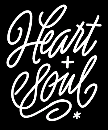
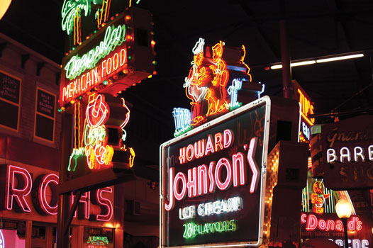
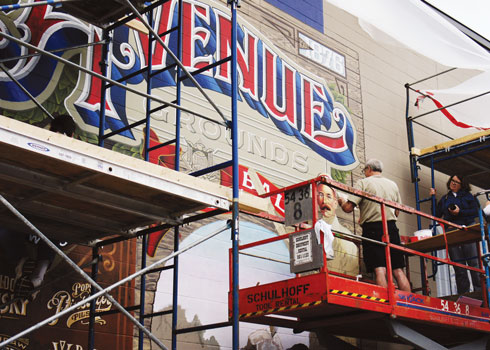
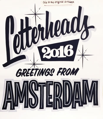
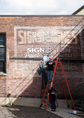
She started posting her work on Instagram (@xheart) and following other artists and groups. The Walldogs, for example, descend on various small towns to paint a blitz of murals over the course of a long weekend. The Letterheads got together in the ’70s just to have a good time but eventually started swapping techniques and organizing competitions.
Frederick has gone to their “meets” in Chicago and Cincinnati, home of the American Sign Museum, and last year’s gathering in Amsterdam. “I’d been to meets before,” she said, “but that one rocked my world, big-time.”
A whole generation of Old Masters, now in their 70s and 80s, sharpened their skills over decades of day-to-day jobs painting billboards, gold-leafing shop windows, and pinstriping trucks and motorcycles. They were fiercely competitive back in the day—and secretive.
John Parker, who opened Parker Signs & Graphics in 1972, remembers visiting a local sign shop when he was 16. “I walked in, and the man lay down his brush. He wouldn’t let me watch him hand-letter,” he says. “Those guys, they’d kind of walk you out to the sidewalk to talk.”
But these days, artists like Parker, 67, are happy to share their tricks with upstarts like Frederick who want to carry on the tradition. He coaches her from time to time at the shop his sons now run in Indianola, guiding her through exercises like a Zen master—part Mr. Miyagi, part Bob Ross.
“We paint a lot of letters, and I’ll make her do those strokes over and over again,” he says. “You could read this stuff in a book and look at a picture, but until you get that brush in your hand, you just don’t get it.”
Artists added their own personal styles to painted and neon signs for most of the 20th century, until computer-assisted designs caught on in the 1980s.
Once, when Frederick’s brushstrokes were too tight, Parker thinned the paint so “she couldn’t dilly-dally, because it would run.” Another time, he grabbed her hand to guide it. She went home to practice, for hours, and texted him long after midnight when she got it right.
“She’s a sponge, that girl,” Parker says. “She’ll listen to anybody who will explain something to her.”
And like a true convert, she explains things to others. When I asked her why she thought the Ro¯CA mural was so popular, she launched into a mini-lecture about ascenders (b, t, h) and descenders (p, q, g) and connecting curves called ligatures. She described the weight and slant and baseline, which “is sort of like a sofa where the letters sit.”
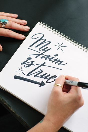
“That’s one thing I like about lettering: There are rules to it,” she says. “It’s the perfect blend of creativity and structure.”
“It’s almost a science with Anna,” says art consultant Liz Lidgett, who organized the Ro¯CA project. “She’s spending the time to hone her craft. She’s really building a technique.”
Lidgett’s company, Adore Your Walls, sold prints of Frederick’s artwork through an Instagram sale earlier this year. Thirty-some copies of the first print sold out in 10 minutes.
“Anna’s work appeals to the masses, but it’s also so beautiful and high-end,” Lidgett says. “It’s hard to find an artist who can do that. It’s a really fresh perspective on an old technique.”
Frederick recently struck up a friendship with Ankeny sign artist Beryl Coulson, who helped design and build the red neon Travelers umbrella that has lit up the downtown skyline since 1963. He also painted the Thrasher’s Hardware sign with another painter named John Paul, a humble project by comparison but one of Frederick’s favorites nonetheless. She suspected it was Coulson’s handiwork even before he confirmed it.
Her projects might last just as long.
“I’d love to paint signs that I could come back and visit—or that somebody else could,” she says. “It’s one of the few things that get cooler with age.”


