You speak, we listen
 Cover Conversation
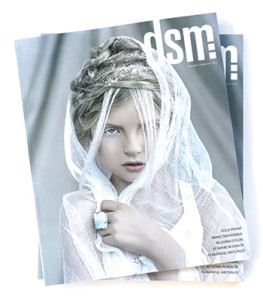
The January/February issue’s cover generated more comments—both positive and negative—than any cover in recent memory. Here’s what some of you had to say. –The Editor
In Our Inbox
Thank you for explaining the selection process (in the editor’s note) regarding the cover photo for the January/February issue and for welcoming comments from your readers as to your choice.
I am taking you up on your invitation. I am uneasy with your cover choice as well as with some of the other narrowed-down options. First, please know that I feel the photography is stunning. The issue for me is about styling—or over-styling: too much fake hair piled on top of a head as if it were a hat, snow that looks more like rock salt, thick makeup. Another troublesome issue is that the sensitive (call it prudish if you like) part of me worries that the child seems afraid that some bad thing that had happened to her is about to happen again.
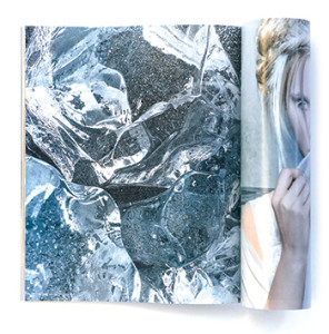
 I admire and support the many creative and seemingly tireless people on the dsm staff as well as your talented contributors. Your current cover choice, however, doesn’t get my vote. Given the options, I would have chosen the ice block image for its intricate, yet simple and natural beauty.
Frank Vaia
On Facebook
(The) cover looks absolutely breathtaking!
Ivy Boyd
On Facebook
Just when I think it can’t get better, you (photographer Ben Easter) pull off something like this!
Mike Triggs
On Facebook
Using the words from the editor’s note: “All of us on the dsm team share the unwavering conviction that kids should be allowed to be kids … (we are) fiercely opposed to the beauty-pageant-like objectification of young girls seemingly rampant in today’s culture. … we rejected the image of Shae with the veil over her mouth. … a veil serves to silence girls and women.” Like it or not, in my opinion, this photo does just what you don’t want to do. Objectification, beauty pageant, child bride, period. I don’t need or expect to see balloons and puppies, but this child isn’t dressed or photographed as a child.
Jim Miller
In Our Inbox
Just wanted to send you a quick note to say the January/February issue of dsm is breathtaking. I have the issue on my desk right now, and the cover alone continues to grab my attention each time I glance at it. Well done!
Sara Bonney


Show Comments (1)
Marna Ford
I just caught the page on Readers React with regard to the January/February issue’s cover. My take on it is mixed. On the one hand, the photography is stunning, and the young girl is beautiful. I am ambivalent about the hairdo, but don’t mind the veil because it really isn’t covering her mouth. Given some old sheer curtains, I and my friends used to love to play dress up and imagine being brides. What bothers me about the photo is the expression in the girl’s eyes. It’s far too knowing for a young girl, and evokes either a sleepy (drug-induced?)languor or Lolita-like suggestiveness–either of which makes one wonder just what the photographer was thinking . . . really. So, I guess I think the photo, while lovely from an artistic point of view, is probably not what the dsm magazine is really about.
Comments are closed.