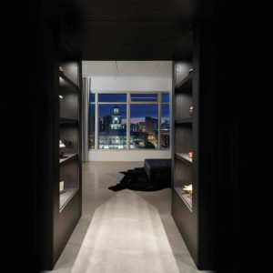
Above: Furnished with a tufted leather pouf by Poliform and an ebony hide rug by Ligne Roset, the gallery serves as a gathering space for parties. Woodwork throughout the loft is rift-sawn, random-sliced white oak, stained and finished to match the black elm used in the kitchen cabinetry. In the gallery it frames the Ecosmart gas-burning fireplace and separates the space from the bookshelf-lined study. On the right, pocket doors open to reveal a dry bar.
Writer: Vicki Ingham
Photographer: Cameron Campbell
Downtown Des Moines has become a magnet for millennials, but it’s also attracting retirees. Jan and Karl Knock of Creston considered a number of cities to retire to before deciding that Des Moines had everything they were looking for.
“It was a priority for us to be on a bike trail, to have a dog-friendly space and to be able to walk to arts events, restaurants and services,” Jan says. Access to health care and to stimulating programs at Drake University were also pluses, and the fact that one son and his wife already live here cemented the deal.
The Knocks set out to find a ground-floor condominium with the idea of ensuring accessibility in future years. But as they looked at properties, they changed their point of view: If they were going to embrace the urban environment, they wanted a view
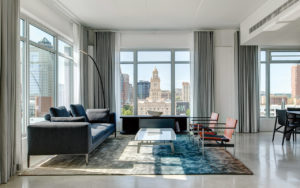
. They found one on the ninth floor of the Whiteline Lofts—panoramic vistas of the Raccoon River Valley, Water Works Park and downtown Des Moines, with the clock tower of the Polk County Courthouse as an arresting focal point.
The view inside was less appealing—the raw space was piled with construction materials and cast-off appliances from other condos in the building. “It was a pretty daunting project,” Jan says, “because we knew nothing about how to build out a condo and we weren’t sure where to start.”
They approached Kelli Linnemeyer at Projects Contemporary Furniture about designing the kitchen for their new home and chose Neumann Monson Architects in Des Moines and Hildreth Construction Services in Norwalk to round out the team.
“Kelli at Projects could source the products we wanted, and we really wanted to do that locally,” Jan says. “We didn’t want to be making trips to New York or Chicago” to choose fixtures, fabrics and furniture.
Although the space was unfinished, it wasn’t a clean slate. “The building was designed a while ago,” says Khalid Khan, principal for Neumann Monson, “so concrete floors and ceiling panels, bathroom plumbing, and in-floor radiant heat were already in place.”
All of the building’s mechanical systems are on the roof, so ductwork and conduit for all nine floors passed through the Knocks’ unit, creating low-hanging clutter at ceiling level. Manifolds for the condo’s radiant heating system had to be concealed inside walls. Working around these constraints was challenging, Khan says, “and yet it gave us a very definitive approach to adhere to, in terms of the overriding principles for the design.”
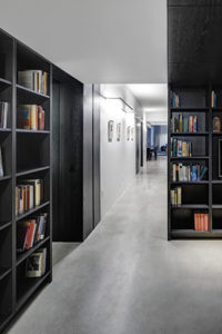
Turning the negatives into a positive, Khan and intern architect Jackson Den Herder used spatial contrasts in the tradition of Frank Lloyd Wright to direct movement and to shape the experience of each area. Lowered ceilings conceal conduit and ductwork, where necessary, and create a feeling of compression and intimacy, while full-height ceilings and walls of glass create a liberating sense of space that capitalizes on the city views.
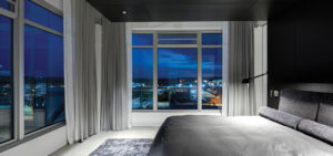
The architectural designers distributed the L-shaped loft’s public spaces between Karl’s study at one end and the master suite at the other. “The dining area, study and master bedroom have access to the balconies, a connection to the outdoors where they might want to linger a little bit and have some fresh air,” Khan says.
The kitchen and pantry form the linchpin of the floor plan. “We both enjoy cooking, and our children and their partners do too,” Jan says. “At Thanksgiving and Christmas we have six cooks in the kitchen.”
Gracie Linnemeyer of Projects designed a workspace tailored to the Knocks’ wide-ranging cooking interests. “They’ve done a lot of traveling in Europe,” she says, “and they were really excited to have some of the products they’ve seen in their travels [used] in their home.”
The Knocks chose white-glass-front upper cabinets and backsplash specifically to reflect the views of the Polk County Courthouse and skyline. “The effect is stunning,” Jan says. “We sit at the counter and eat lunch and look at the reflection in the cabinets.” Black elm, popular in Europe but a new finish in the United States, covers the ceiling, base cabinets, bar overhang and refrigerator panels. Black glass ovens blend with the wood for a seamless wall surface.
The pantry, which matches the kitchen in size, includes a desk for Jan, space for Karl’s wine collection, and its own complement of storage and cleanup appliances. Connected to the kitchen by a counter-height pass-through door, it’s ideal for caterers as well as the family’s behind-the-scenes food preparation. Pocket doors close off the area for noise control.
Along with a highly functional kitchen, the Knocks wanted a dog-friendly environment that was energy efficient, sustainable and accessible for aging in place. The architectural designers addressed energy efficiency with on-demand water heaters, low-flow toilets, zoning that allows areas to be closed off when not in use, and energy-saving motion-activated LED lighting. Other accessibility features include the high-contrast color scheme, which makes it easier to find your way through a space, and the pocket doors, which can remain open, allowing for easy movement for wheelchairs and walkers (and dogs).
The sleek minimalism of the loft’s architecture and interiors is dramatically different from the Knocks’ previous home in Creston, which was a historic structure filled with antiques and family heirlooms. During their travels, Jan fell in love with the Scandinavian aesthetic—the clean, uncluttered spaces, modern design and a place for everything—and Projects helped them choose furniture and accent lighting to suit the new look.
Karl welcomed the opportunity to declutter and downsize, but he says Jan “bought further into the idea of a space that is all modern and minimalist than I did. So one of the things I wanted was a library or a study with bookshelves.”
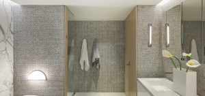
For the master bathroom, the architectural designers chose marble penny tile for the walls and floor, and Kelli and Gracie Linnemeyer suggested the dramatic wall of book-matched statuary marble slabs from Rowat Cut Stone & Marble Co. In keeping with the modern look the Knocks wanted, Projects Contemporary Furniture outfitted the space with a sleek soaker tub, a Corian countertop with integrated double sinks, and mirror-faced medicine cabinets, all from the Italian manufacturer
Rifra. Sconces from Roll & Hill in Brooklyn supplement the recessed cove lighting installed by the architects. The floor continues into the shower without the obstacle of a threshold, making it accessible for a walker or wheelchair if that would become necessary.
“We both like to read and we like conversation space,” Jan says. “We’d been living in a house where every room had its own function and doors to close it off from the other rooms. [The loft] is all open space, contiguous—and Kelli was brilliant in giving each space its own sense of purpose just through the choice and arrangement of furnishings and mix of textures.”
The 18-month project stayed on track with weekly and then twice-weekly meetings with all parties. “Working to design a home like this is a really intimate process,” Jan says, “and you have to like the people you’re working with, because they get to know a lot about you—maybe more than you’re comfortable with. I have really deep respect for the team, and we’re so delighted with the results. There’s not a thing I would change.”


