Above: A dramatic sculpture (fused bronze on steel) by Des Moines artist James Bearden commands attention in the entryway of a recently renovated midcentury modern home in the city’s Southern Hills neighborhood. The original lighting and brick wall help the space maintain its midcentury character, but the ceiling—previously a drab almond hue—was painted white, allowing “more light to filter in and bounce off the lighter surface,” says designer Hal Davis. Topped with a cowhide rug, the new walnut floor replaced chipped, 6-by-6-inch clay tile.
Writer: Christine Riccelli
Photographer: Duane Tinkey
Over the past decade, Brad Lowe has built a booming business buying, renovating and renting homes around Greater Des Moines. But recently the former Johnston police officer realized he wanted to move in a different direction. “I got tired of doing cookie-cutter projects,” he says.
Specifically, he says, he wanted to restore and transform “one-of-a-kind homes and estates.”
Last summer, he found the unique property he was looking for: a 3,200-square-foot home built in 1966 in the Southern Hills neighborhood. Lowe teamed up with interior designer Hal Davis, who sought to rev up the home’s livability yet maintain its character and midcentury modern style.
One of Davis’ biggest challenges was updating the layout while keeping the architecture intact. “The house was built as a series of boxes, but the boxes didn’t flow because of the different floor coverings,” he says.
So Davis eliminated the mishmash of flooring—mauve carpet, terra cotta tile, dated linoleum—and installed solid walnut flooring in the main living spaces to match the existing doors. On the walls, crisp white paint replaced the tired wood paneling and dingy buttercream paint.
Window treatments also were removed. “We wanted the home to be light-filled and airy, bringing in nature to create a sense of serenity,” Davis says. “Before, it had a drab, institutional look.”
For furniture, artwork and accessories, Davis turned primarily to Homemakers, blending contemporary and vintage-inspired pieces. He also dropped in authentic yet still functional midcentury modern furnishings as well as custom-made pieces. Works by acclaimed Des Moines sculptor James Bearden add striking sophistication.
Midcentury modern style “is about restraint—letting the structure be the overall feature and eliminating embellishment and bling,” Davis says. “So we went for an uncluttered, minimalist approach focusing on clean lines. In this kind of house, less is definitely more.”
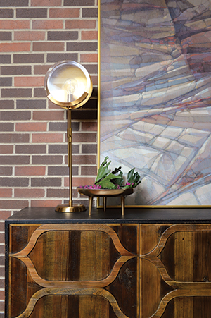
Davis was drawn to the entryway credenza because of its rustic look and modern detailing. The brass lamp and the art—an original work from the late 1960s by Elizabeth Miller, a well-regarded Des Moines artist who died in 2013—evoke the era. The plant arrangement of tropical palm and purple mums complements the artwork and provides a serene touch.
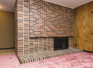
In the living room, mauve carpeting and paneling were replaced with solid walnut flooring and white paint (eggshell Sherman Williams “Pure White”) on the walls. The ceiling beams were repaired and restored. Davis says he used white quartz on the hearth “to give it a contemporary flow and to draw the eye to the uniqueness of the fireplace.”
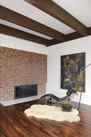
In creating the vignette, Davis kept the furnishings to a minimum with a vintage LC4 Cassina lounge chair, a Ligne Roset floor lamp from Projects Contemporary Furniture, and a custom end table (blackened and polychrome steel and fused bronze) by sculptor James Bearden. A vintage sheepskin rug softens the space, while the art “balances the masculinity of the fireplace and draws in some of the colors from other artwork in the house,” Davis says.
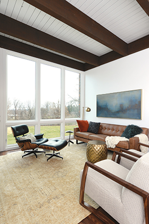
The living area opposite the fireplace features a leather couch from Homemakers and an Eames-inspired chair. In the corner between the couch and window is a new stacking table (oil-rubbed bronze with a black base coat) that James Bearden has created for Studio Van den Akker in New York. The previous window treatments weighed down the space and cluttered the view, Davis says, so he decided not to replace them. The result? An expansive view and plenty of light, which reflects off the wool and silk rug.
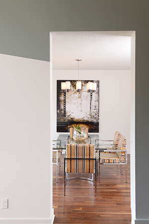
In the dining room, the 1972 chairs and glass table, along with the original chandelier, convey authentic midcentury modern style. Designed by Milo Baughman for Thayer Coggin Furniture, the chairs “are vintage but functional,” Davis says. “The house is not a museum; all the vintage furniture is meant to be used.” He chose the artwork because it’s “impactful and draws from the colors of the upholstery.”
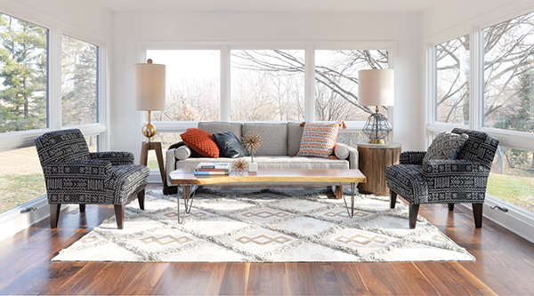
For this sun-filled room, a 384-square-foot addition built in 1997, “we wanted the space to be laid back and kid-friendly yet sophisticated enough to meet a client there if it’s used as a home office,” Davis says. (A desk anchors the opposite side of the room, not visible in the photo.) Furniture from Homemakers helps create the contemporary casual look and feel, while the rug adds texture. West End Architectural Salvage custom-made the coffee table from a repurposed walnut slab. The table’s hairpin legs are a nod to midcentury modern design, Davis notes.
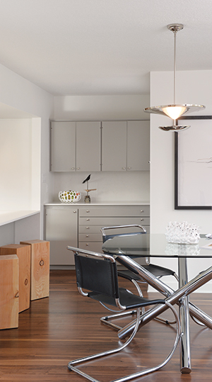
In the kitchen eating area, vintage chairs designed by Mies van der Rohe are paired with a new table and chandelier that recall midcentury style. The pine counter stools, custom-made by West End Architectural Salvage, “bring an organic and warm element to the space and reflect the boxiness of the house’s architecture,” Davis says.
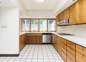
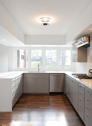
Now fresh, appealing and functional, the kitchen was made over with new appliances, walnut flooring, lighting and white quartz countertops. In keeping with the clean-lined design aesthetic, Davis used two-centimeter quartz, instead of the typical three, and ran the quartz up the wall to create a seamless backsplash. The original cabinets were painted a high-gloss gray (Sherwin Williams “Ellie Gray”).
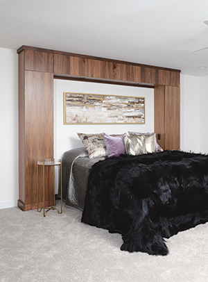
In the remodeled master bedroom, Minnesota Cabinets custom-made the headboard in a classic midcentury modern design. “The bedroom is so big that it needed a feature piece to hold the space,” Davis says. The cabinet’s sides open for storage and plug-ins while two spotlights above are ideal for reading. The Minotti Italian goatskin rug, used here as a bedspread, from Projects Contemporary Furniture adds striking flair. “I love the touch of glam it gives the space,” Davis says.
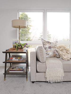
The master bedroom is also large enough for a seating area, which includes an end table and couch from the new Ellen DeGeneres line at Homemakers.
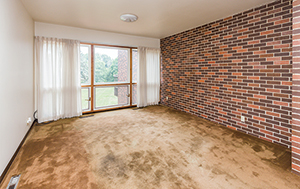
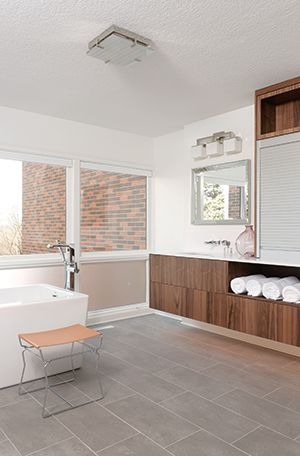
The most dramatic transformation was turning a former office, which had a doorway from the entryway, into the master bathroom, which now opens from the master bedroom. For the renovation, Minnesota Cabinets built the sleek cabinetry, and Davis chose tile from Sunderland Brothers for the floor. “I liked how the tile repeated the rhythm of the exterior brick and brought the outside in,” he says, adding that the linear tile also helps elongate the space. A bathtub and spacious shower (not seen in the photo) anchor opposite sides of the bathroom. The Ligne Roset bench from Projects Contemporary Furniture helps finish the space with sophistication.


