Above: In Amanda and Michael Reynal’s home, texture and tone abound in the neutral design scheme. In the living room, black glazed abaca makes the walls distinctive while a metallic raffia wall covering provides punch. Cream-colored chenille fabric covers the classic-style sofa. Underfoot, a wool and sisal area rug sits atop a hand-cut, white oak floor laid in a herringbone pattern—the same handsome hardwood flooring that distinguishes the entire first floor. Metallic and mirrored surfaces on the walls and furniture contrast with the rustic raffia Billy Baldwin-style slipper chairs. To add more texture and color contrast, the ceiling was lacquered a stark glossy white.
Writer: Laurel Lund
Photographer: Adam Albright

“We lovingly refer to our new lifestyle as ‘fun-sizing’ rather than downsizing,” muses designer Amanda Reynal, principal of Amanda Reynal Interiors.
Reynal and her husband, Michael, moved from a 6,000-square-foot South of Grand home to an elegantly designed 3,500-square-foot home in the same area.
The decision several years ago to move to a smaller space came as their two sons, Henry and George, now 18 and 15, respectively, were preparing to leave for private school in the East.
“We wanted our sons to live in a house that was familiar to them before they left for school so that when they returned on holiday they would feel at home,” Reynal says.
The move was a success. When the couple purchased the newly flipped, open-floor-plan house, it had been partially renovated. Although the plain-vanilla structure had great bones, Reynal wanted to put her design skills—rooted in studies in New York, London and Italy—to work to finish the buildouts, create built-in storage, select new lighting and hardware, and choose personalized window and wall coverings for every space.
The couple’s capacious former home had been decorated in a riot of color to visually delineate space. But to visually expand space at their smaller new address, Reynal chose a neutral palette and an international design style juxtaposing a variety of textures and bold black accents. This approach anchors the space and creates a seamless flow from room to room.
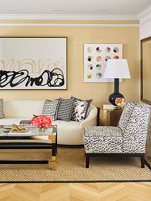
The casual open-space seating area, once a traditionally enclosed living room, is perfect for entertaining, which the couple does frequently. The room flows into the dining area and well-appointed gourmet kitchen. A diamond-pattern sisal area rug anchors the faux horn-and-brass cocktail table, which is surrounded by a classic sofa and armless chairs upholstered in a fabric that underscores the black accents that punctuate the space. A contemporary oil painting by Nashville artist Kayce Hughes, a childhood friend of Amanda’s, becomes the room’s focal point, offset by a work by New Orleans-based artist Logan Ledford.
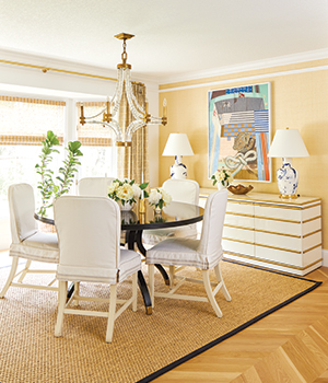
Opposite the casual living space is the dining area used for both family and formal mealtimes. At the center is a black lacquer pedestal table with reupholstered dining chairs from the Reynals’ former home. An abstract multimedia artwork by Des Moines artist Aaron Tinder hangs over the faux-goatskin lacquer buffet with gilt accents.
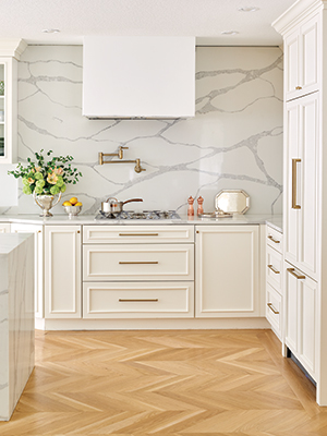
Polished white quartz adds elegance to the kitchen walls and island, which has a waterfall edge. Simple yet sophisticated floor-to-ceiling storage cabinets with and without glass fronts are topped with classic crown molding and framed with contemporary hardware. A sculptural range hood adds a graphic design element.
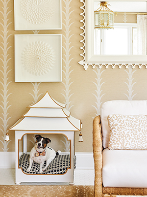
The family’s beloved Jack Russell terrier, Parker, is just another delighted devotee of Reynal’s design talents, having her own canine castle to call home.
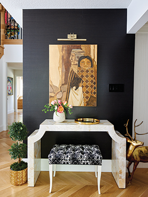
Upon entering the Reynals’ home, guests are greeted by a dynamic design statement: A black wall contrasts with a white lacquer console, drawing the eye to a Peruvian painting that Michael inherited from his parents.
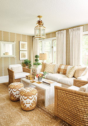
Separated from the living area by newly installed French doors is this sunroom that leads to a backyard entertaining space. In keeping with the neutral color scheme of the home, the casual living area offers a smorgasbord of tint and tone.
Atop the white-oak wood floor is an antelope-print area rug that was in the Reynals’ former dining room. A classic sofa, reupholstered in an indoor-outdoor chevron-print fabric, is flanked by natural seagrass armchairs and ethnic-print ottomans.
Center stage is a custom-made, ash-wood cocktail table, the work of Des Moines-based Aronson Woodworks, which boasts a patented finish called Claize that highlights the wood grain. The distinctive ceiling light fixture, once a blue-accented accessory rescued from the couple’s former breakfast nook, was refinished to blend into the space.
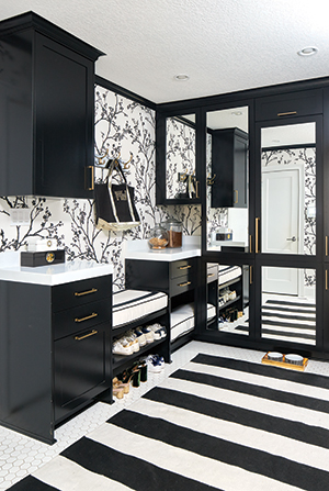
One of the most dramatic rooms in the house is the mudroom, a stark study in black and white. Because the space can be seen from the heart of the home, Reynal wanted to make the design distinctive: Ebony storage cabinets hide winter wear, shoes and puppy playthings, while black floor-to-ceiling, mirrored storage closets conceal a wine cellar, a soda station, and cleaning and laundry equipment.


