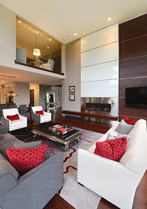
Homeowner Rick Snyder says that although the interior designer took a less-is-better approach, “we were careful not
to make it sterile.”
Written by Vicki L. Ingham
Photos by Duane Tinkey
The design for Rick Snyder’s new home started with a conversation over coffee. He had built his first home, a traditional-style townhouse, in the Glen Oaks development in 2003. When he decided to build again in 2013, he wanted something different.
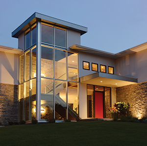
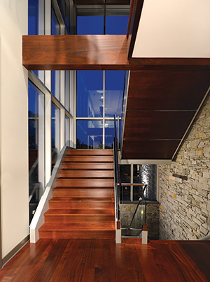
Noticing the houses that Steve Dallenbach of Dallenbach Larson was constructing nearby, he introduced himself and they met at the country club to talk further. As the builder quizzed Snyder about his lifestyle and tastes, Dallenbach says, “the notion of a cube form came to mind.” On some scraps of paper, he sketched a glass tower for the stairwell and floor plans for three levels. These proved to be the starting point for Snyder’s new home.
Dallenbach introduced Snyder to architect Karl Chambers of Imprint Architects, and Snyder met interior designer Sheila Waller of Your Surroundings through another referral. The three formed his “dream team.” Working together, they created a 6,700-square-foot showplace of classic contemporary design.
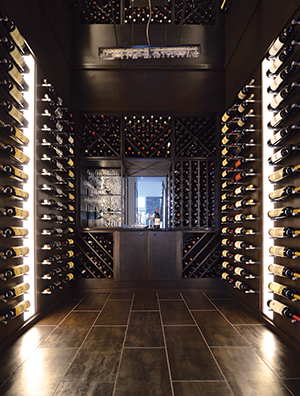
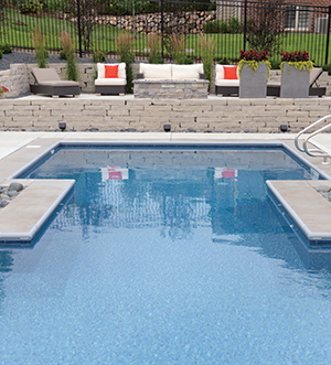
Snyder travels extensively for his job as an investment banker at Wells Fargo, “so when I’m home, I like to be at home,” he says. The house is tailor-made for either unwinding alone or entertaining friends. In addition to the dinner-party-friendly kitchen-dining-great room area and wine room on the main floor, Snyder has a home theater and a game room downstairs. In the back yard, an I-shaped saltwater swimming pool forms the focal point of an outdoor living space that includes a weatherproof kitchen, a flat-screen TV and 10 speakers for surround-sound music.
Snyder has a 3-year-old son, so the house needed to be welcoming for him too. “Even though we took the less-is-better approach,” he says, “we were careful not to make it sterile.”
To that end, Waller combined rich mahogany and gray stone to warm up the expanses of glass, tile, chrome and stainless steel. “I chose a neutral palette,” she says, “so the look would be clean, comfortable and have a soft feel with a contemporary edge.” For a punch of color, she added red accents.
A year after moving in, Snyder finds that he enjoys the uncluttered space. “I consider myself to be structured and traditional,” he says. “This house is quite
the opposite. I was a little nervous at the onset, but I am now a true believer in the contemporary design and couldn’t be happier. I love coming back from a business trip and being home.”

