Black, white and blush pink accents tie the living room together and repeat through fabrics, pillows and accessories. Designer and homeowner Meghan Blum mixed furniture styles but kept the scale of items similar. Photographer: Carolyn Vaughn Photography

Writer: Missy Keenan
When interior designer Meghan Blum and her husband, David, bought their 1915 Tudor home in Waterbury three years ago, it had great bones and beautiful architectural details. The dated kitchen was ready for a full remodel, but otherwise Blum just wanted to freshen things up with surface updates, including a lot of paint.
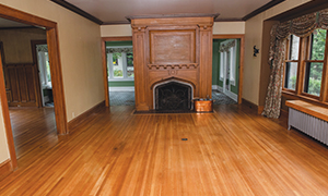
During the home’s six-month remodel, the living room and dining room kept their original footprints and architecture, but were transformed with new wide-plank oak floors, statement lighting, wallpaper and paint.
The living room was painted with neutral greige walls and white trim, while the Tudor fireplace surround got a coat of semigloss black to create a focal point.
“When I design a room, I always think about where I want my ‘wow’ moments,” Blum says. “For the living room, that was the fireplace. It would have looked good painted white, but the black gives it the drama I wanted. It’s a pretty unique detail and it needed to pop.”
The living room’s furnishings are favorite pieces brought from the family’s previous neighborhood home. Black, white and pink pillows and other accents pull the room together.
“We actually use our living room,” Blum says. “It’s not one of those living rooms that’s just to look at. We watch TV in here and we put on music and dance with the kids. And we light the fireplace a lot in the winter. It’s fun to think of all the fires that have been burned here over more than 100 years and the stories that have been told around it.”
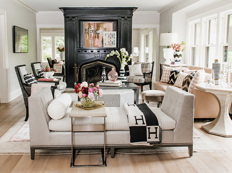
Semigloss black paint (Sherwin-Williams Tricorn Black) turned the fireplace surround into the wow moment. “It holds its color and doesn’t take on any other hues,” Blum says of her go-to black paint. Performance fabric on the sofa is family-friendly for the Blums’ three young kids. Photographer: Carolyn Vaughn Photography.
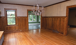
Adjacent to the living room is the dining room, which got more white trim, black and white chinoiserie wallpaper to tie in to the fireplace nearby, black patterned wallpaper on the ceiling, and a large crystal and gold chandelier.
“The dining room has a few wow moments,” Blum says. “But my favorite thing in here is the dramatic light fixture. It’s not something you see everywhere, and it really makes a statement. Lighting is key in most of my projects. Even in an otherwise ordinary new house, lighting can add drama to any space and up its game.”
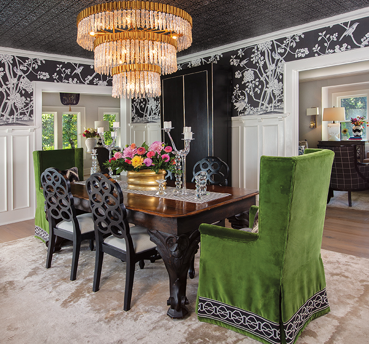
White paint, black chinoiserie wallpaper, and a large gold and crystal chandelier from John Richard amp up the dining room. Blum unified the traditional table, clean-line cabinet and even the bottom of the upholstered chairs with black. “I think the mix of styles is interesting and is a little less expected,” she says. “It’s easy to pick out matching stuff, but the room becomes more artistic and interesting when you use the mix.” Photographer: Duane Tinkey
While the living and dining rooms received cosmetic updates, the kitchen got a full gut remodel—combining a 220-square-foot kitchen and small mudroom to create a 280-square-foot space. A 10-foot-long marble waterfall island with wainscotting detail in the same marble dominates. White Shaker-style cabinets are topped with marble countertops and a counter-to-ceiling backsplash. Blum designed the space with mixed metals—silver with brass accents on the statement range and curved hood; brass hardware, faucet and shelf brackets; and brass-accented mercury glass pendant lights.
The kitchen is another room that gets a lot of use from this busy family with three children under age 8. The double oven lets Blum make a lasagna on one side, chicken nuggets for picky eaters on the other. Blum’s second grader does homework on one end of the island, while Blum cooks at the other end and is readily available for homework help.
“I wanted our kitchen to feel light, bright and classic and be the center of our home,” Blum says. “I think that’s what we achieved. I love it.”
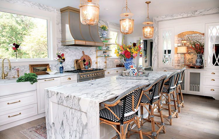
A 10-foot marble-clad island helps make this kitchen the heart of the family home. A mix of finishes provides depth and interest. “It also allows you not to be completely tied to a particular finish in a room,” Blum says. “And then especially with accessories you can move them all over your house.” Photographer: Carolyn Vaughn Photography
How to Mix Patterns
Want to mix more patterns in your own home? Try these tips from Meghan Blum, homeowner and interior designer.
Choose a unifying pattern or motif.
In Blum’s living room, black, white and blush pink patterns pull your eye through the room and into the dining room.
Limit your color palette.
“Too many colors can detract and make each piece in your room feel like it stands alone,” Blum says.
Vary pattern scale and styles.
Avoid using all stripes or all florals, for instance. And avoid using all small-scale or all large-scale patterns. Mix it up—pillows are an easy way to make changes.
Make the oddball the focal point.
In Blum’s dining room, the only gold is the light fixture, making the piece pop against the black and white. The hue continues in the kitchen.


