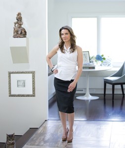
Karin Edwards of Karin H. Edwards Interiors believes fine art is to be honored, respected—and lived with.
Written by Vicki Ingham
Photos by Amy Allen Photography
For Karin Edwards, art is never mere decoration. Instead, it’s an integral part of the space. Whether the Des Moines-based designer is hanging art in her own home or in a client’s condominium, her approach tends to make installations feel inevitable—that each piece is right where it’s meant to be.
With a curatorial certificate from the Metropolitan Museum of Art, master’s degrees in art history and in museum studies—soon to be joined by another master’s degree in architecture—and a background in design journalism, Edwards brings a distinctive perspective to living with art. She credits her experience as a curator at several New York City museums and as a researcher at the Frick Collection for teaching her what she knows about displaying art: how to create vistas that draw the viewer down a hall and around a corner, how to arrange effective groupings, and how to balance busy walls with calming blank space. While working for New York City galleries and art dealers, she installed exhibitions of Old Master paintings as well as contemporary art.
“There’s a huge difference between hanging art in a home and in a gallery,” says Edwards, owner of Karin H. Edwards Interiors. “In a gallery, it’s about the object. In a home, it’s about the person and that person’s appreciation for the piece.”
Combining art-world expertise with an interior designer’s sensibilities often leads to unexpected placements, such as hanging a piece below eye level. A painting hung under a window or just above the floor leads your eye down and creates a feeling of stability, Edwards says. “I don’t hesitate to put furniture in front of art either,” she says, as layering creates depth that makes a room more interesting.
Or take a wall at the end of a corridor: It might seem like the obvious spot for a focal-point piece. “But one piece of work at the end of a hallway is too eyeball-grabbing,” Edwards says. Instead, she may mass a gallery of prints, hanging them from floor to ceiling and wrapping a corner. “It makes the space feel broader, and it draws you in,” she explains.
Likewise, conventional wisdom says a large piece belongs over the fireplace or on a wall by itself. Edwards says that’s often a mistake because the art overpowers the room: “Your eye focuses on that one piece, and the room feels smaller. It also makes the room about the art, not the people in it.”
Instead, she advocates grouping the large “statement” piece with a variety of smaller ones. “You have to moderate the force of each piece,” she says. “A powerful one is often more successful when it’s in a grouping. It’s about making the pieces live together peacefully.”


