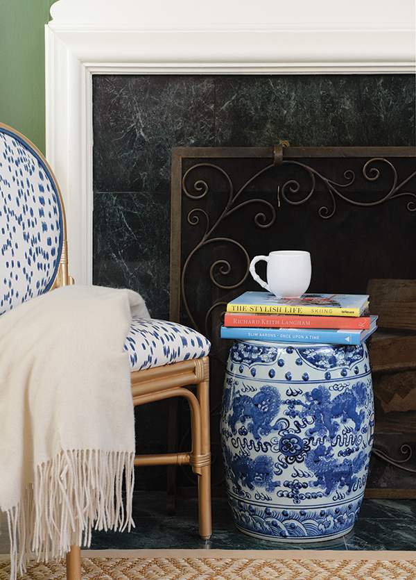
Above: An asymmetrical arrangement can provide a boldly striking, yet still balanced, design for your mantel. Turn the page to see the complete look.
Writer: Missy Keenan
Photographer: Duane Tinkey
Asymmetric Balance
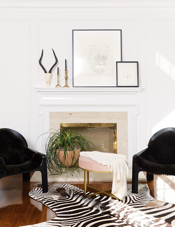
Many people arrange mantels symmetrically—a painting or the TV in the center flanked by matching candles or vases. But for this mantel in a South of Grand home, designers Michelle Pulver and Michelle Cownie chose an asymmetrical approach.
This type of arrangement, though, still requires balance, Pulver says. “Start with one focal piece and then go off that. For this grouping, we knew we wanted to use this beautiful impala skull,” she says. “Try looking around your house for items in the same color family as your focal point but make sure they’re different heights, weights, textures and even styles. Then just keep playing with them in different arrangements until they feel balanced.
“The other key to this mantel design is that it doesn’t include very many objects,” she adds. “Sometimes people think you need so much, but less can be more when you do it right.”
Great Heights
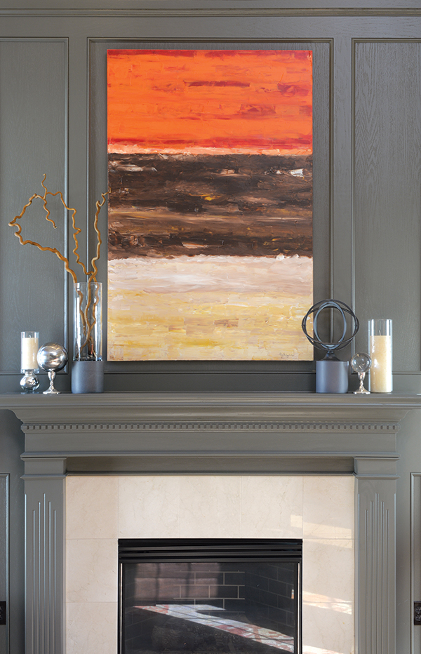
If your room has high ceilings, don’t be afraid to go big with your mantel decor. In this Johnston living room, the homeowner’s friend, Iowa City artist Julie Fitzpatrick, created a large-scale painting to fit the space. The painting is flanked by objects that contrast with the artwork in both shape and texture.
“You get the most impact with just a few large objects on your mantel,” says interior designer Juli Verrant. “If I had used a smaller painting and a bunch of little votive holders in this space, they would have gotten lost.”
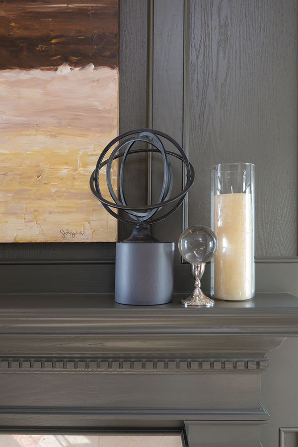
In addition to keeping objects small in number and large in scale, Verrant makes sure the pieces bring contrast and light to the mantel.
“My number one rule for mantel design is to bring in some light and warmth,” she says. “When the fireplace isn’t in use, it’s just a black box in someone’s home. Here I used shiny metal items and candles in glass holders.
Since the focal point is rectangular, the accent pieces are round. But if your focal point is something like a round mirror, you can add contrast with rectangular accents.”
Keep It Simple
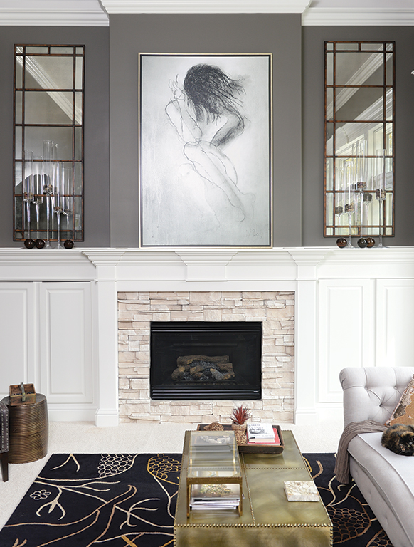
If your room has high ceilings and a wide mantel like this one in an Ankeny home, interior designer Kathy Sorbe recommends using a few large objects to complement the grand scale of the space. Here, a large work of art is flanked by equally large mirrors.
“With a space of this scale, it would be a mistake to fill it with a lot of small tchotchkes,” says Sorbe, owner and lead designer of the Elements, a home design and furnishings store in Ankeny. “We chose to keep everything simple, but big. We also kept all of the elements monochromatic because we wanted to support the mantel in a quiet way, not compete with it.”
Winter Green
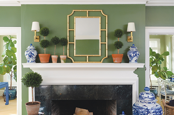
In the darkest days of winter when her Christmas tree has gone to the curb and she’s taken down the sparkly holiday decorations, interior designer Amanda Reynal likes to bring a touch of life to her mantel. Here she chose live myrtle topiaries raised by her neighbor, a faux bamboo brass-framed mirror, and blue and white chinoiserie urns.
“I like to put a mirror over the mantel because it’s like bringing another window to the room,” Reynal says. “I chose a brass-framed mirror because brass brings a year-round glow and warmth to a space.”
She added the brass sconces for another source of light and the topiaries “to give some life to the room and for the great texture and tone-on-tone green against the walls,” she says. “I have to keep them trimmed and watered, but it’s worth it to have the extra bit of nature indoors at this time of year.”


