Our Favorite Covers
If you read dsm, you know we celebrate each new issue with a party. It’s a fun way to mix it up with our friends and fans, unveil the cover art and distribute the new magazine, hot off the press.
But there’s another bonus: The cover posters we unveil end up in the dsm office, which, after 20 years, feels almost like a museum gallery of both beautiful artwork and the recent history of Des Moines. Our staff works “under the covers,” day in and day out, and continues to draw inspiration from the images long after the magazines in which they appeared are gone.
Here are just a few of our favorites, all designed by Annabel Wimer.
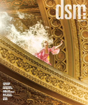
May 2015, photo by Ben Easter.
It’s so extravagant and over the top — the architecture, the costuming, the smoke. It’s just perfect. It sucks me in, and I want to know more. Why is she surrounded by smoke? Why is she reaching out in despair? What happens next? It just screams “melodramatic,” and I love it.
— Alex Kelly, assistant sales manager and account executive

May 2014, photo by Ben Easter.
The long bangs hanging down are fun. My brother-in-law recreated the exact look for a photo we took of him, too.
— Jason Swanson, vice president for operations
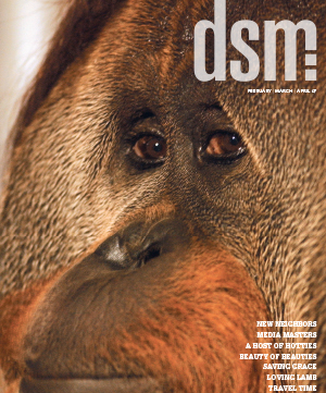
February 2007, photo by Duane Tinkey.
Azy was definitely ready for his closeup. The orangutan, then 29, stares into the camera with a look of deep wisdom that even most human faces can’t match. I like to imagine he winked right after Duane snapped the shot at the Great Ape Trust.
— Michael Morain, editor

August 2013, photo by Joelle Blanchard.
I have so many favorites for different reasons, but this one features someone I’ve known since she was a little girl. I directed her in what I believe was her first acting role, in a children’s theater production of “A Thousand Cranes” at our church. It was amazing to see her in this new light, and her mom was incredibly proud.
— Eileen Jackson, business and human resources director
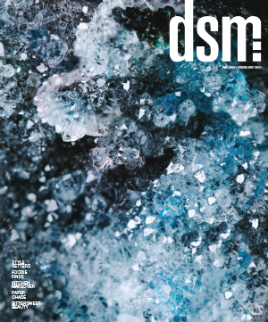
January 2016, photo by Karla Conrad.
I like the otherwordliness of this photo, how it almost seems like an image from a NASA probe on a new planet. Of course, when I realized it’s actually close-up image of jewelry, was equally curious to know what kind of stone or gem looks that way. (It’s druzy quartz.) The cover made me want to turn right to the story and read about it. I think that’s the best marker of a good magazine cover!
— Hailey Allen, assistant editor
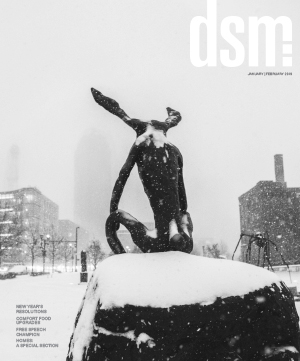
January 2019, photo by Mike Hiatt.
I like the image of Barry Flanagan’s “Thinker on a Rock” because it’s both funny and quiet — two characteristics that usually don’t go together. Besides, it reminds me to appreciate the beauty of Iowa’s character-building winters.
— Annabel Wimer, design director

July 2015, photo by Tonya Scarcello.
I couldn’t not pick a cover featuring one of our four legged tail wagging, furry friends. As someone who loves rescue animals, this one definitely touched my heart. Despite getting a drink of water, the cover model still looks up for a great shot. They’re so photogenic.
— Kyle Heim, staff writer and copy editor
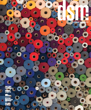
November 2021, photo by Jill Neil.
I get lost in this photo of spools at the Hotel Millwright, which is in a former woolen mill in Amana. It’s fun to see up close and from far away, and the way the photo fills the whole page makes me feel like I can reach out and touch the thread. Combing over all the colors and different sized spools makes me feel like a kid again, doing hidden object puzzles in Highlights magazine.
— Sarah Diehn, Business Record digital news editor

July 2021, photo by Duane Tinkey.
dsm loves dogs, and we’ve had many dog cover photos over the years. I can only imagine how many shots it took to get that perfect ice cream lick. This cover also brings back memories for me because it was our first in-person unveiling party after the pandemic shutdown, and Duane’s dog Tilly got to help reveal the cover.
— Sarah Gotto, magazine creative team lead
This one is Duane’s favorite cover, too, and he shared the back story. “I picked up four vanilla cones and put them in the freezer because I knew it would give me more time with Tilly’s eager tongue. I used two cones the first round and gave it another try the next day with the last two cones, when I got the final shot that landed on the cover. I’m pretty sure she got a brain freeze. Tilly and my daughter, Sophie, helped unveil that cover, which was pretty special.”

January 2023, photo by Ben Easter.
Choosing my favorite cover is like choosing the proverbial favorite child. It’s simply impossible, given those children — those stunning, fantastic children — numbered over 100 during the time I was the dsm editor. But I’ll offer why I love the photo of former Des Moines Art Center director Jeff Fleming. Like all great portraiture, the evocative photo is both a technical and artistic triumph, revealing a side of Jeff rarely seen in his public role — that of a contemplative, soulful artist. Also, while we’ve featured many striking young people on our covers, this was the first one showcasing a 66-year-old man on the verge of retirement. So really, what’s not to love?
— Christine Riccelli, former editor
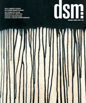
Jun Kaneko sculpture
Long before I started working for dsm, the magazine was a fixture on the coffee table in my living room, where my home interior and personal aesthetic is predominantly (some might say obsessively) black and white. So the closeup shot of a Jun Kaneko sculpture (above) reigned on top of the stack until the clematis flower gone to seed (below), which in turn was bumped by the woman in the turtleneck and then the portrait of Jeff Fleming. And now it’s the Arnaldo Pomodoro sculpture (below) at the Wellabe headquarters, with its graphic nature and captivating tonal range. As the pages turn and the years unfold, this cover seems destined to linger at the top of the stack.
— Lynne Belknap, director of marketing and business development
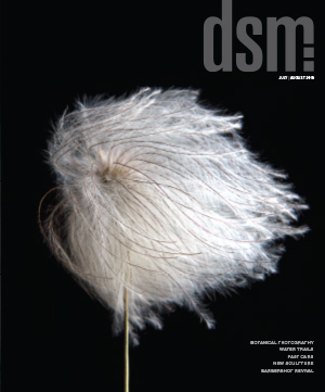
Clematis flower gone to seed

Arnaldo Pomodoro sculpture


