Writer: Laura Kristine Johnson
Photographer: Chris Boeke
Talk about a throwback. Midcentury style has had a revival in recent years, but Lynette and Kurt Rasmussen’s 1960s-era kitchen, complete with steel cabinets, wasn’t so much trendy as it was tight and tired.
“People would come over and say, ‘What’s up with this kitchen?’ ” Lynette says. “They’d want to hang out (there), but its galley-style layout made that impossible.”
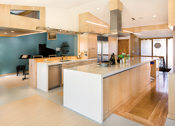
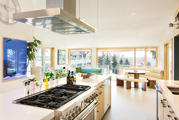
The couple enlisted the help of Silent Rivers Design + Build designer Tyson Leyendecker, whom they’d worked with on several other updates around their home. They wanted a kitchen overhaul that would strike the delicate balance of adding contemporary finishes while staying true to the aesthetic of their 1966 midcentury modern home in Johnston. “The kitchen is at the center of the house, so we wanted to turn it into a central hub by opening it up to the dining space and tying the exterior to the interior,” Leyendecker says.
The result? A clean-cut kitchen that nods to the family of five’s Danish heritage, connects the house visually and functionally, and packs plenty of perks. Trade journal Professional Remodeler even named the Rasmussen kitchen its Project of the Year in 2015.
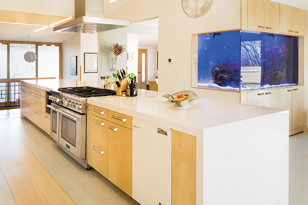
To add natural light and create an open layout, Leyendecker knocked out the original kitchen walls, absorbed a former screened porch into the space, and converted an unused playroom into bar seating and a music room. A 650-gallon saltwater aquarium replaced a closet for an aquatic touch, and five seating areas provide plenty of space for family and guests to lounge with a cocktail, chat over food prep or dial in on homework. Removing upper cabinets and favoring lower drawers contribute to the space’s open feel.
One of the biggest challenges was adding new birch cabinetry to existing birch elements that had been finished nearly 50 years earlier, Leyendecker says. “Birch tends to amber over time, so we consciously avoided putting old and new pieces of wood in the same plane to trick the eye into not noticing the variance.”
Leyendecker attributes the kitchen’s success to careful planning that began several years ago when the family slowly started to update their home. “We figured out what the Rasmussens’ style was from the first project we worked on with them. As we updated the house, we put new elements in place that spoke to what was already there but also to what was going to happen in the future.”
Since the kitchen’s completion, the Rasmussens have noted that the revamp has not only better connected their home’s layout but also their family members to one another. The larger kitchen lets each person have their own space while remaining in the same room.
“The kitchen is our go-to spot for spending time together,” Lynette says. “It’s beautiful, it’s functional, and it’s more streamlined. It’s perfect for us.”
 A multi-level spice drawer next to the range makes accessing seasonings easy—no digging through a pile of Tones containers with this set-up. “I try to do as many drawers as possible in a kitchen because, since they extend fully, they’re more accessible than cabinets,” says designer Tyson Leyendecker of Silent Rivers Design + Build. “Some drawers even have another drawer inside, so shorter things can go up top and canned or boxed goods on the bottom.”
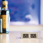 Leyendecker opted for countertop pop-up outlets so that both sides of the island could be used for storage rather than one side being devoted to an outlet, he says. Building code requires that islands have at least one outlet so cords don’t drape across the floor. “The pop-up outlet is a modern touch,” Leyendecker says. “It’s out of sight and out of mind most of the time but there when it’s necessary.”
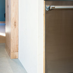 A medley of materials adds visual interest to the Rasmussens’ kitchen, with warm wood tones offsetting cooler metal and stone elements. Here, a stainless steel dishwasher tucks into the quartz counter, which is then nested by a 6-inch-thick butcher block bar top. “Waterfall countertops, where the counter rises, turns, and then falls to the other side, are trendy right now,” Leyendecker says. “Pairing quartz with butcher block, though, is something you don’t normally see.”
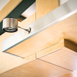 Mono point lights—often used in retail stores to highlight clothing—brighten the kitchen sink space, and their adjustable heads let the Rasmussens direct light where it’s needed. “The lights’ stainless steel band also makes a nice transition and contrast between the upper and lower cabinets,” Leyendecker says. “There was a stainless steel detail in the old cabinets, so this was also a throwback to the original kitchen.”
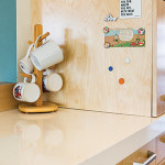 The side of a kitchen cabinet doubles as a magnetic posting place for photos, papers and to-do lists thanks to a steel sheet insert inside the plywood material. A birch veneer, thin enough to allow the magnetic attraction through, disguises the set-up. “We used to hang football clippings, softball schedules and the like on our old steel cabinets,” Lynette Rasmussen says. “Now we have a posting place in our new kitchen as well.”
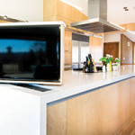 Rather than purchasing separate TVs for the kitchen and dining spaces, the Rasmussens opted for a lift feature that allows one TV to swivel 180 degrees so it can be seen from every corner of the room. The TV can then disappear into the island when it’s not in use to avoid a constant sports bar-like feel.
Laura Kristine Johnson is a Des Moines-based freelance writer and an editor at Meredith Corp.

