Above: A detail of a side table in the dining room. The concentric rings reflect the many lives and memories that have been hosted by this midcentury ranch home.
Writer: Kelsey Batschelet
Photographer: Duane Tinkey
At the height of midcentury design in 1956, a spacious ranch home was built just outside of Des Moines. Little did the builders know they were creating a time capsule. The home remained unchanged until six decades later, when it was sold to its current owner—a man who briefly lived in the house as a child. “The mahogany cupboards were the same, the cork floor was still there,” says the homeowner, who requested anonymity. “I thought it was absolutely beautiful.”
To a young boy, he recalls, the home had seemed extraordinary—spacious, modern and eye-catching. Returning to the house as an adult, the homeowner felt the same excitement about the space, but knew it would take talent, patience and an eye for detail to bring the space into the 21st century.
With the structural renovation underway, the search for a designer began. Drawn in by an artfully styled showroom window, the owner soon set up a meeting with Stacie and Kelli Schulz, the lead design team at K. Renee, a home furnishings boutique in West Des Moines.
“It was a perfect match,” he says. “I knew they had the talent to honor the architecture of the home while bringing in modern updates.”
In that first meeting, the homeowner pointed out an acrylic cocktail table from Bernhardt Interiors in the showroom, which served as the inspiration for the rest of the interior design. “It gave me a feel and an idea for where he wanted to take the space,” Kelli Schulz says.
But establishing a vision was just the first step. Styling a ranch house can be an exciting, although challenging, endeavor. Each room can function as a distinct, stand-alone area (thanks to those oak pocket doors), but still needs to flow together with the others. “The home had beautiful midcentury lines, and we built off of that,” says Kelli Schulz.
The K. Renee team combined modern pieces with the home’s original elements to achieve the homeowner’s vision. Many of the furnishings are from Bernhardt Interiors and Mitchell Gold + Bob Williams, a line well-known for its updated midcentury vibe.
“Kelli and Stacie helped me make the dream come true,” the homeowner says. “It’s more than I ever thought it could be.”
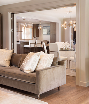
Though the decor is new, this top-to-bottom 1950s ranch house renovation hasn’t forgotten where it came from. Note the bifold solid oak pocket doors tucked back into the wall to open up the space—and the light fixtures illuminating the kitchen island. Each is a modern redesign of the home’s originals. Period touchpoints such as these are found throughout the house, alongside artistic and trendy updates, such as the crystal cube dining room table.
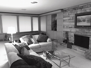
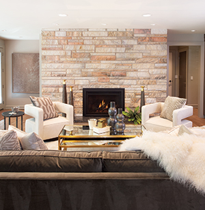
As part of the renovation, the home’s doorways were widened from a narrow 30 inches to a more comfortable 36 inches. The living room fireplace posed a challenge to widening one of the doorways, but the homeowner was keen to preserve it. Incredibly, the mason who applied the fireplace stone in the ’50s still operated in the area with his son and grandson.
The mason removed the stone from the wall and fireplace, laid it out in the same pattern in another room and opened up the doorway. After the doorway was renovated, the stonemasons re-laid the authentic fireplace stone in its original design—adding a hearth for a modern touch. Many of the furnishings that complement the fireplace were sourced from Mitchell Gold + Bob Williams.
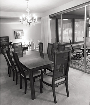
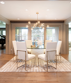
A mix of modern and ’60s-era mod brightens up a formerly dark dining room. “Chrome adds a beautiful, bright, reflective quality, as do acrylics and other shiny surfaces,” says Kelli Schulz. “In an older home, ceilings tend to be lower and don’t receive as much natural light through windows. These kinds of surfaces assist in brightening the feel of a home.”
The K. Renee team focused on situating design-forward furniture alongside pieces that evoked the home’s history, such as the light fixture above the dining room table. The table is designed by Bernhardt Interiors, which is carried exclusively at K. Renee. “The dining table inspired the look and feel of the entire space,” Schulz says.
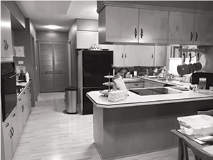
Before
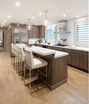
The kitchen received a complete face-lift, which involved removing a closed-off U-shaped counter and cramped built-ins, and dropping in a bar-style island. The flat-front mahogany cabinets got a 21st-century update without straying from the original design intent. “We stayed true to the architecture,” says the homeowner.
That approach influenced the K. Renee team as well. “Our client loved clean and angular lines, which you see throughout the furnishing selections,” says Kelli Schulz. “The homeowner never strayed from the house’s original elements. On occasion I was concerned it was going to make the spaces feel heavy—but with the complement of the decor, it all turned out beautifully.”
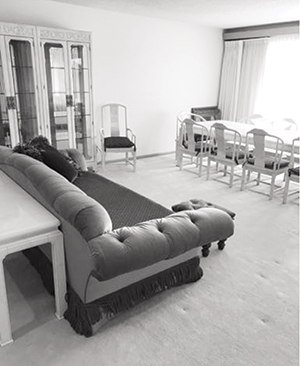
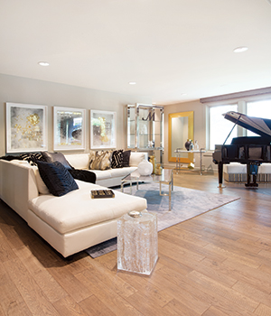
“The homeowner had specific feelings he wanted to [evoke] in each of the rooms,” says Kelli Schulz. “For the piano room, he wanted it to be a little more lounge-y, with some more color added into the space.” The team pulled elements from across the home to encourage a flow between the rooms. Note the acrylic side table next to the sectional, reminiscent of the crystal cube table in the dining room. “Many of the acrylic items were pieces [from the Bernhardt Interiors line] our client loved and was drawn to,” says Schulz.
“The colors and the furniture just make it pop,” says the homeowner. “The whole house reads so well together, but there’s always the opportunity to section off a room and let it be perfect by itself.”


