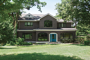
Above: This compact midcentury modern house stayed true to its 1952 roots when it was updated with 21st-century function and flair. It’s the first of several successful renovations presented here.
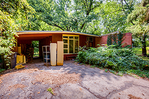
Above: Before
Writer: Kelly Roberson
Function and Flair
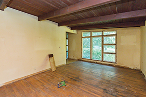
The problem: In a word, livability. The one-story, midcentury modern home was not functioning well; it had six inches of water in the basement and mold everywhere, says Nicholas Donlin with Zenith Design + Build, who also is the homeowner. In addition, a stairway to the basement had been plopped down in the middle of the house, separating the living room from the kitchen by a wall that visually and physically blocked the entry.
The goal: At its most basic, create functionality. Let the bones and the lines of the 1952 home shine and update everything for modern needs.
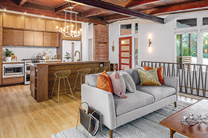
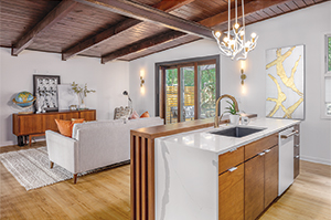
The solution: Donlin gutted the home but retained its post-and-beam framework and the 4-by-8 beams that accented the tongue-and-groove ceiling. He removed the wall dividing the living room and kitchen and added load-bearing support in its place. He also replaced the staircase with one tucked along an outer wall. The result is a soaring, “connected” main floor
that feels much bigger than its 1,052 square feet.
“The biggest impact was moving the stairway,” Donlin says. “That really just makes it. When we are redoing a house, we always try to include a wow factor. When you walk in, you can see the kitchen and living room all at once.”
The home’s entry was also falling off, so Donlin added a grander transition between inside and out with spot-on details like a sliver of brick inside that draws the eye through the space. In the connected living-kitchen area, a multipart glass patio door extends living space outside, onto a deck kitted out with a pergola, projector and screen. That patio door, which replaced a 36-inch exit door and tiny windows, also floods the interior with light so that the richly stained ceiling doesn’t dominate the space.
Finally, Donlin added all those 21st-century practicalities, from a kitchen island to storage. “You don’t see much of this style in Des Moines,” he says. “It’s a very cool midcentury modern home.”
Photographer: Kerry Bern, Prep Iowa
Before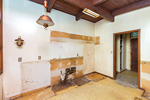
After
Practical Elegance
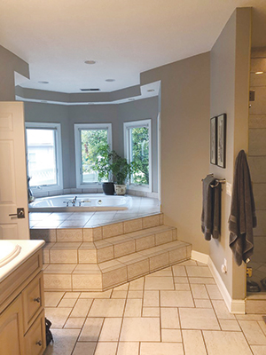
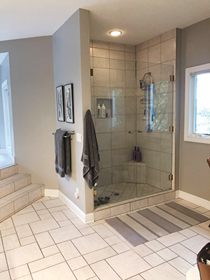
The problem: A decades-old bathroom with a perplexing layout. A corner bidet had never worked, a toilet stood out almost in the center of the space, and stairs were the only way to negotiate an enormous tub—“one of the largest I’ve ever seen in my life,” says Donna Alley, a designer with Fleming Construction Co. Lastly, the bathroom had little countertop work area and no storage space, with nary a shelf or drawer for a spare towel, lotion or any other necessities. In a nutshell: For all the square footage, the bathroom wasn’t indulgent or efficient.
The goal: Form plus function, with all the additions, such as a double vanity and storage, that make life easier for a busy working couple. In addition, the homeowners wanted the bathroom to feel spa-like and restful.
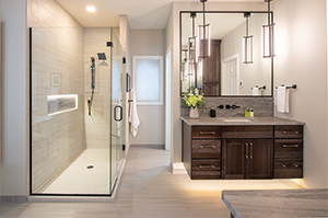
The solution: Alley and Fleming Construction collaborated with the homeowners to create a streamlined, elegant space with loads of natural light, luxe touches and practical storage. In went a double vanity with plenty of elbow room, plus under-the sink cabinets in a warm, rich brown to hide and organize all the extras.
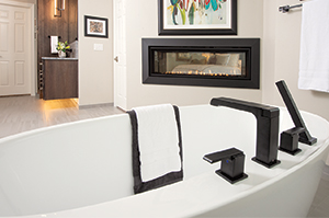
Alley centered a free-standing tub underneath a window nook, with a glassed-in, roomy shower just steps away. “We were very fortunate because so many times in a project, you’re limited by the amount of space, and here we had a lot of great space,” Alley says of the 350-square-foot room.
“By taking out the tub deck and replacing it with a free-standing tub, we created negative space so it doesn’t feel crowded. That’s one of the things about the project I like the most—it’s intimate without feeling packed.”
Two details stand out: the countertop and the fireplace. The former is leathered quartzite with a less reflective finish that has just enough texture and a hint of sheen to keep it from feeling too glam. Alley and the homeowners agreed on a 12-inch backsplash, with faucets mounted directly on the wall, for a little more unexpected visual punch.
The double-sided fireplace unites the master bathroom with the adjacent bedroom. On the bedroom side, the fireplace surround is a floor-to-ceiling marble slab, but Alley chose to leave it minimally detailed—just a simple metal frame—on the bath side. “Sometimes design is knowing when to stop,” Alley says, “and setting if off simply was the perfect choice.”
Photographer: Duane Tinkey
Before
After
Timeless Yet Modern Style
The problem: A well-maintained Craftsman-style house South of Grand that nonetheless had a mixed-up second floor: choppy ceilings (thanks to its half story), limited flexibility and storage, and an odd stairway that led down into a third bedroom.
The goals: Deliver reasonably expansive closets and separate baths for both children. Add a master bedroom suite with a large walk-in closet, enabling the entire family to sleep on the same floor. Fix the storage; not only was it inadequate, but it was also sized incorrectly in depth and height for the needs of today’s families, says Carrie Norris with Grand Homes and Renovations. (The homeowners also remodeled the kitchen and added a guest bedroom suite on the main floor.)
The solution: Raising the roof to accommodate a full story for the entire second floor enabled the family and Grand Homes to add timeless style and hardworking purpose to every inch of the home. Each child now has a bedroom and private bath. The second story’s hallway now features a cozy niche with seating as well as a laundry room, centered efficiently among the bedrooms.
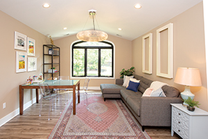
The parents, meanwhile, can retire after a long day to the master suite, which includes a bathroom and spacious walk-in closet. Finally, a loft (pictured, above) offers a cozy escape for crafts or reading.
“We love this house because it is not trendy,” Norris says. “The style is … true to the homeowners. They were able to incorporate both their styles to make this the perfect home for them.”
Photographer: Duane Tinkey
Before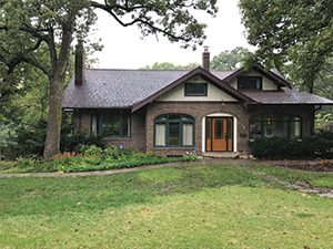
After
