Writer: Hailey Allen
Photographer: Chris Boeke
When Chris Boeke takes a photo, it’s almost always in black and white as he views the composition, lighting, shapes and patterns as the most intriguing aspects of buildings and objects. Just because something is pretty and colorful, he says, doesn’t always mean it becomes a great image.
Boeke has been a photographer for about 15 years. Much of his work captures buildings, interiors and design details that he takes for architects, designers and builders. For the project featured on the following pages, however, he sought out a more artistic side of architectural photography.
Through much of 2022, Boeke shot exteriors of iconic buildings around Des Moines. “I creatively pushed myself to find things within downtown that even I have never stopped to really take a look at … and maybe show people a new experience,” he says.
It was important to him that the spaces he photographed be publicly accessible. He wanted people to be able to walk by the buildings so they could develop a new appreciation for how to view each one as art, not just as a place.
“If you’re lucky enough to know the story of the building you’re photographing, you have a better understanding of what [the architect’s] vision was when creating the space,” he says. “So now as the photographer you’re trying to capture their artistry in your own voice but respect theirs as well.”
U.S. Bank Building
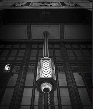
Completed in 1932, the five-story U.S. Bank building (520 Walnut St.) is a landmark of Art Deco architectural design. Boeke says he wanted to bring attention to the stylized entrance by photographing the hanging chandelier that visually anchors the space.
The fixture also shows viewers a different perspective of a building they may drive or walk past regularly. Especially in a city where buildings are situated close together, Boeke says, it can be challenging to find an artistic angle if you photograph the building as a whole. “You don’t see those certain shapes or the significance of an overhang,” he says. “You get a profile, like a silhouette.”
The chandelier is “a symbol of that building,” he notes. The details are echoed in the vertical lines of the window panes, making the overall effect seem larger than life.
Krause Gateway Center
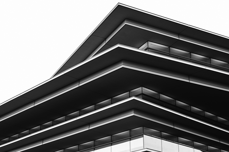
Designed by internationally acclaimed Italian architect Renzo Piano, the headquarters of Kum & Go (1459 Grand Ave.) opened in 2018. The five-story LEED-certified building features glass prominently on all sides, with the roof overhangs serving as both an artistic and energy-efficient element.
“This [photo] was kind of a happy accident,” Boeke says, referring to the blown-out sky. In technical terms, this means that the camera settings allowed too much light to come through and overexposed the image. Thus, a completely white sky.
“This was taken in the afternoon, and it was actually really cloudy,” he recalls. “So it was hard trying to get enough light to expose the detail in the shadowed parts under the overhangs.” As he looked at the resulting photo, he found that he liked the composition he’d created through the shapes and the stark contrast of black and white areas.
Wellmark Headquarters
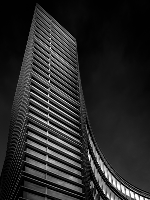
“Without question, you drive by it and you know what you’re looking at,” Boeke says of the curved courtyard entrance of the Wellmark Blue Cross and Blue Shield headquarters, a five-story, 603,000-square-foot building (1331 Grand Ave.) completed in 2011. “People already know what it is,” he says. “Trying to capture that building in the context of a whole isn’t really going to give a viewer any more than what they can already experience in person.”
So instead, he set out to shoot details of its shape. From the perspective pictured here, the curve of the building seems to create a large column that frames the building, like a modern Pantheon. The sharp edges of the building meet at a point in the corner, drawing the eye into the sky. “I saw this towering up and then the dip of the curve, and I was like, ‘I feel like there might be something here.’ It’s a stark detail of something much larger,” Boeke says.
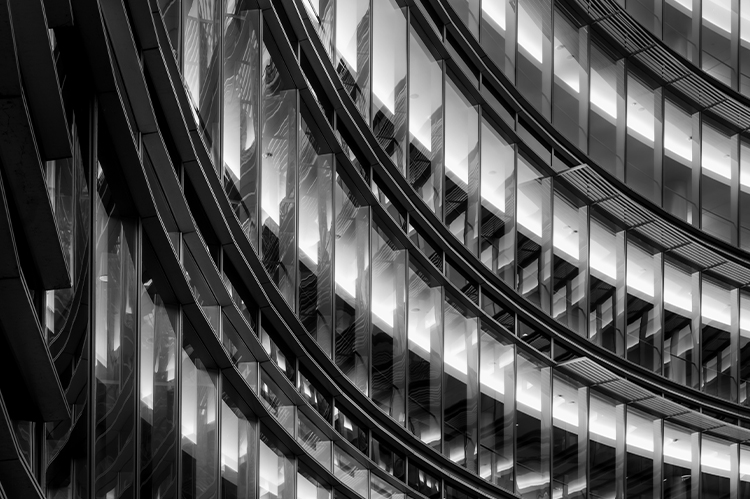
The challenge of this image, Boeke says, was getting the massive Wellmark building to fit into a smaller frame that captures its details, without sacrificing its overall character. “We all know these lines are horizontal,” he says. “This shot gets it to the point where it looks almost vertical, curving up.”
The pattern of the lights visible through the windows also creates a unique gradient of light and dark. “The way the shade awnings also get highlighted by light from within breaks things up from a texture standpoint, too,” Boeke says. “There are just layers upon layers here.”
Women of Achievement Bridge
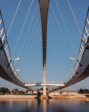
The curved shape of the Iowa Women of Achievement Bridge is easy to spot from nearly anywhere along the Des Moines River downtown. The bridge was completed in 2010 to honor Iowa women’s contributions to the local, national and global community. Boeke says he wanted to capture “the monumental significance of what the bridge is and show that in an image that hasn’t already been done before.”
Originally, this image was shot in black and white like the others in the series. However, in this case, Boeke believed black and white distracted from the composition. “It becomes very dark [and] things start to get lost,” he says. “This image is more about the shapes and the lines, and I think it starts to lose the intended interest in black and white.” For him, the blue sky fading into the warm sunlight at the shoreline created a more interesting mood.
He also snuck a hint of the Capitol in the background, which adds the city’s signature building to the image, he says. “I needed to find where I needed to get height-wise so I could come down low enough to raise the bridge up, and then just get enough of the Capitol,” Boeke says. “It was very intentional.”
American Enterprise Group
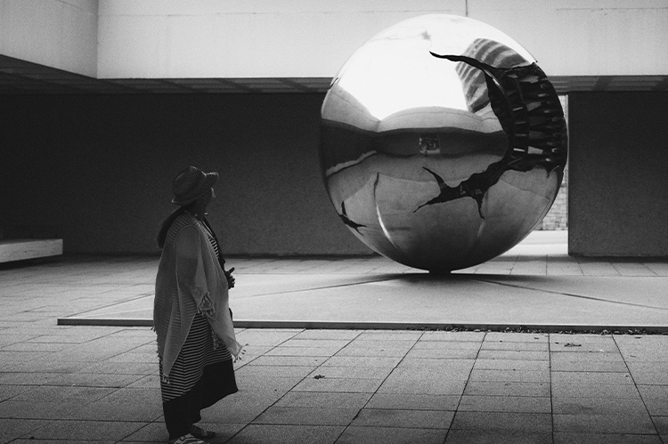
“Sphere Within a Sphere,” an 18,000-pound bronze sculpture by Arnaldo Pomodoro, marks the entrance to American Enterprise Group (601 Sixth Ave.) and is part of the company’s public art park.
“What I love about this shot is that everything is so square and geometric, and then you have this round shape right in the middle,” Boeke says. “And not just a simple round shape—you [also] have a broken, sculptural element.


