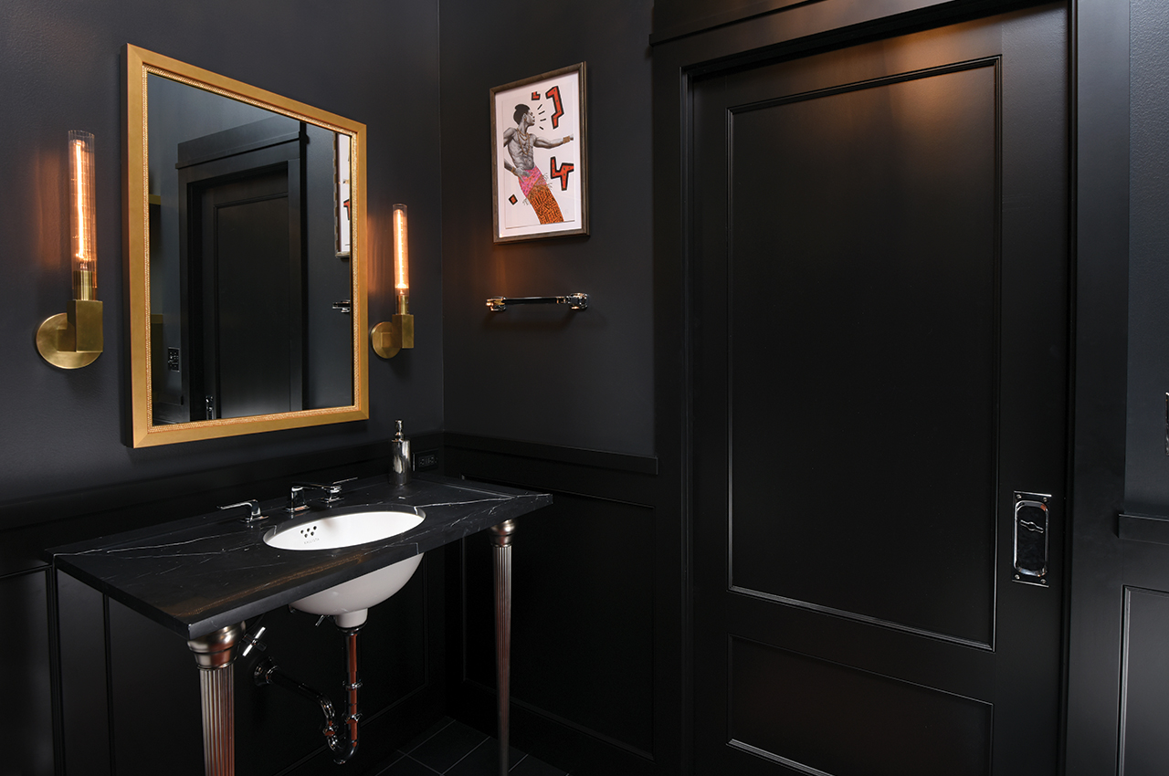
Above: The loft’s guest bathroom was transformed into a dramatic, art deco-themed space in multiple shades of ebony and charcoal. A ginger-colored rug accents the jet-hued stone floor while the black-and-brass inlay tiles in the tub surround enhance the room’s luxurious feel.
Writer: Laurel Lund
Photographer: Paul Gates
One of the many charms of urban loft living is the seemingly endless expanse of space. Ironically, that charm comes with a challenge: a lack of defined functional areas.
That was the main reason Dean Anderson, a vice president of accounting at Wells Fargo, and partner Austin Zepeda, office manager for Back Country, called upon designer Catherine Thomas of the eponymous firm CRT Design Co. to help them redesign and redefine their condominium in downtown’s Brown Camp Lofts.
The couple met Thomas in 2015 for what would become a three-phase design/build collaboration. Phase one of the five-year project included reconfiguring and reoutfitting the master bath. Phase two in 2018 transformed the guest bath. And phase three in 2019 involved overhauling the kitchen. All phases were done in collaboration with the remodelers and master craftsmen at Silent Rivers Design+Build and Oakwood Builders Group.
Anderson and Zepeda “were very involved with every detail to make certain it was just right,” Thomas says. “They also invested a great deal of trust in me and the construction teams to deliver a design that not only met but exceeded their expectations.”
The result of the teamwork among the couple, designer and contractors is a meld of new and existing design elements that honors the men’s lifestyle and the patchwork character of the loft itself. Although Anderson and Zepeda’s design tastes differ, the design team was able to incorporate both their styles into a unified whole.
“Combining Dean’s sense of minimalist style and my more eclectic sensibility made the project work because we both wanted a more contemporary, fun, homey place to live,” Zepeda says.
Getting there was a challenge, however. Anderson had purchased the penthouse in 1998 “because I like walking to work,” he says, but he hadn’t done much to it since moving in. Both men managed, however, to live through the chaos and construction. Most homeowners can seal off at least one room during construction to get a reprieve from the remodeling noise and nuisance. But not in an open-plan loft.
“I climbed through plastic sheets to get to my closet,” Anderson says with a laugh. “There was dust everywhere. We had no stove, no kitchen sink. I had to get water from the bathroom sink to make my oatmeal in the morning.”
“We couldn’t cook, so there were lots of pizza deliveries and takeouts involved,” says Zepeda, adding that eating out for months was decidedly worth the result.
“We’re thrilled with the results, both functionally and aesthetically,” Anderson says. “The synergy of the team was amazing. The entire project has been life-changing.”

Rather than focus on color, the couple wanted the art deco-styled guest bathroom to be a showcase for the room’s design details and for their collectibles. So the team chose to mix 50 shades of deep gray to add texture and depth. Details include wood wainscoting in a custom paint color and a space-saving, custom-made pocket door. Metals are artfully mixed, with the loft’s original copper plumbing overhead juxtaposed with brushed brass sconces and stainless steel faucets.

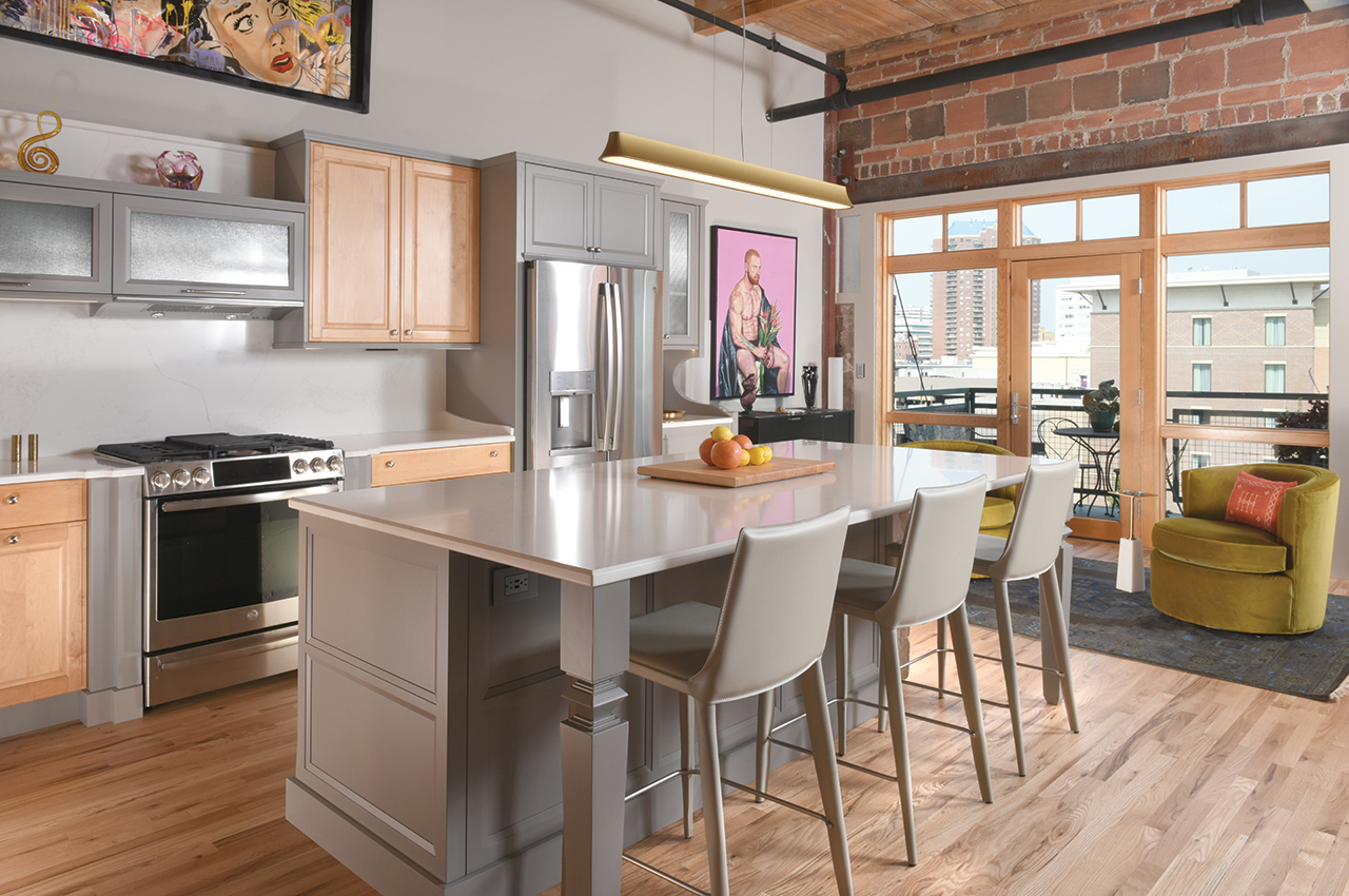
Unlike the dramatic guest bathroom, the kitchen is a neutral-hued space. Redesign goals included combining new cabinets with the existing maple cabinetry; replacing a small, elliptical kitchen island with one that is larger and more functional; adding more storage space; transforming the dining area into a cozy conversation space; and giving the area a fresh, updated look.
The design team recycled the kitchen’s original maple cabinet fronts and incorporated them into new cabinetry in a contemporary gray finish. They also found new cabinet doors that complemented the existing ones. Incorporating linear cabinets above the range in lieu of more solid cabinetry visually opened up the space.
Thomas also added a beverage bar leading into the previous dining area. Here the pair can mix a mean espresso to enjoy in the colorful club chairs nearby. “Better yet,” Anderson says with a laugh, “our side tables are just the perfect size to hold a Manhattan!”
The new kitchen island with art deco detailing not only doubles the size of the original island, it provides a new dining/entertaining space with storage below.
Outdated oak kitchen floors, the same throughout the loft, got a fresh look after being sanded and sealed with a light, natural-satin finish.

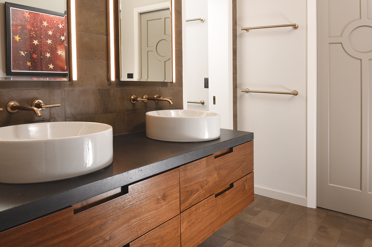
Originally, Anderson and Zepeda had to walk through the master closet to reach the bath. This cheated them of both closet and bath space. “To solve the problem, we switched the two areas—placing the commode and shower in a private room behind the double-sink vanity area,” Thomas says.
More space-saving ingenuity can be seen in the floating-vanity drawers. To accommodate bathroom plumbing, custom vanity drawers were built with inserts for pipes. Pocket doors also reign as supreme space-savers in the en suite setup. Note the custom laser-cut millwork on the doors to the bath and shower room.


