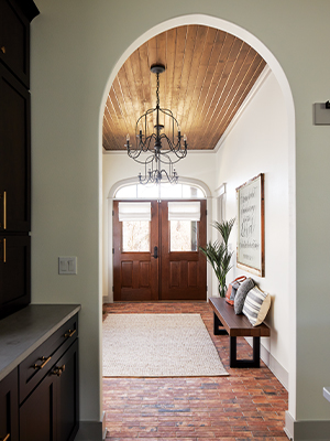
Designed and built by husband-wife duo Hanna (she’s the designer) and Jonathan Shiplett (he’s the builder) of Eden and Gray of West Des Moines, this new home in rural Warren County features Old-World character thanks to materials such as the thin brick flooring used in the entry and rustic wood paneling covering the ceiling.
Writer: Beth Eslinger
Photographer: Adam Albright Photography
It may seem unconventional that ’70s tunes, LaCroix sparkling water, dog photos and a wedding monogram were some of the design inspiration for this new home in rural Warren County. But that’s the point of Eden and Gray’s approach.
At the start of each project, the West Des Moines-based team quizzes its clients with personal questions, such as what’s your favorite drink, your go-to song, your preference in art, says designer Hanna Shiplett, who runs the business with her husband, Jonathan. They use the answers to create a word cloud for the project’s overall feel. “We ask silly questions to understand our clients,” she says.
And it made an impact with the homeowners, both area medical professionals. The couple, who requested anonymity for this article, say they appreciated the Shipletts’ personal and unique approach.
The homeowners found the 5-acre lot, complete with a run-down house, junked cars and other rubbish, and saw potential for their dream family home. They were especially drawn to its seclusion and privacy.
Once the lot was cleaned up, the homeowners turned over the design and build to Eden and Gray. “This was the first time a client unleashed me to do everything,” says Hanna, who also decorated the interior.
The design duo walked the site and oriented the home to take full advantage of the wooded views. “We took inspiration from what was happening in the land,” she says.
The open and relaxed home is a combination of French modern and farmhouse—with the dining table outside on the porch in the tradition of European country homes. “The patio is technically their dining room,” Hanna says.
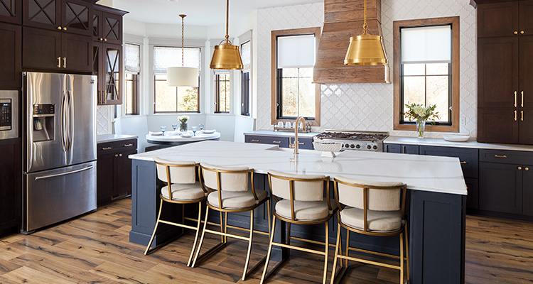
With rich wood tones, warm brass fixtures and cabinetry pulls, and sparkly arabesque-shaped tiles, the kitchen exudes European elegance. The X motif in the upper glass cabinetry repeats throughout the home, including in the dramatic staircase.
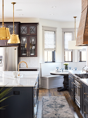
Because the homeowners opted out of a dining room, seating was built in the corner breakfast nook. The homeowners say that the great room and kitchen provide plenty of space to set up extra tables for guests.
The Shipletts built in consistent elements such as arches, wood beams, shiplap, arabesque motifs and bronze to add character. “It’s Gothic modern farmhouse style but with the modern conveniences of an open floor plan,” Hanna says.
Vintage elements such as an interior stained-glass window, an antique dentistry cabinet and pantry doors from the Savery hotel add depth and texture. Hardware throughout the home feels old-fashioned.
Perhaps the main star is the staircase that zigzags to the second level, with the arched window as a focal point on the second-level landing. The windows are an important element in the design and a big portion of the budget, Hanna says.
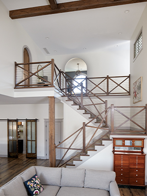 The wood from the ceiling beams carries into the staircase. “In art school they talk about composition,” designer Hanna Shiplett says. “We want the viewer’s eye to go to the arch and the chandelier.” Wires provide safety to the staircase for the couple’s young child. At the base of the stairs, a vintage dental cabinet gives a nod to the owners’ medical professions and is another conversation-starter.
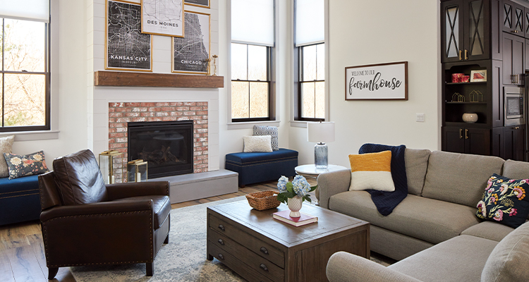 The dark kitchen cabinetry color repeats in the living room furnishings. “Generally my rule is no more than three wood tones in any given space,” designer Hanna says. “The espresso cabinetry ties into the ceiling in the next room.” Rustic-color wood beams define the ceiling and fireplace mantel. Windows throughout the home—except two in the kitchen—are painted black, serving as mascara for the room.
To create additional visual impact, the design team “used Frank Lloyd Wright’s theory of contraction,” Hanna says. “Our ceiling heights change. The front brick entry expands into the kitchen and expands further into the living room. It continues to build.”
The result is a home that’s comfortable, family-oriented, classic and adaptable—other key results of that personality quiz and the resulting word cloud.
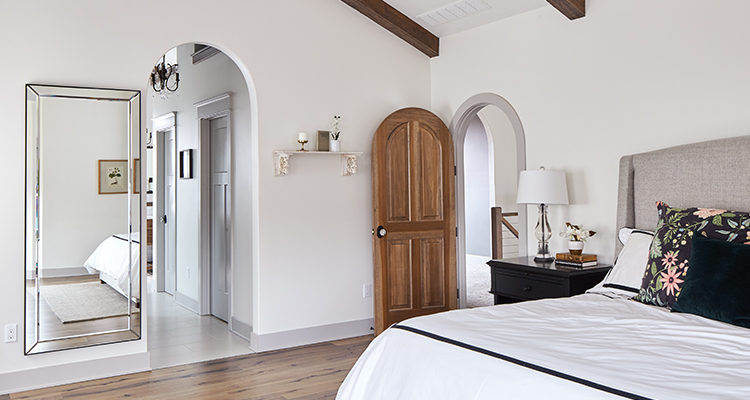
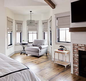
The master suite combines rustic black elements with the feminine lighter colors. “We wanted it to be a space that combined the couple perfectly,” Hanna says. The arches repeat throughout the home. Hanna notes the bright white wall color helps expand the room and contributes a sense of peace. The cozy sitting area overlooks the property’s rolling hills and trees.
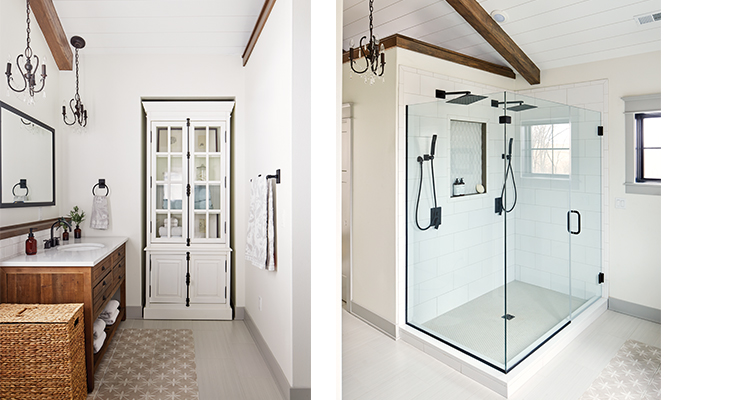 A wall ledge behind the vanity hides plumbing and provides functional display space. An accent “rug” created from patterned tile adds interest to the floor. Another luxe touch in the vaulted bath: double showerheads. The built-in shower niche features the elegant arabesque motif used as the kitchen backsplash.


