A 10-foot island serves as the central family hangout in this Polk City kitchen. Scroll down to learn more about the space. Photographer: Kelsey Sutton Photography.
Writer: Beth Eslinger
All these kitchens were entries in dsm’s inaugural Home Design Awards, revealed March 9. To see additional projects—including some dreamy outdoor spaces just in time for summer—click here. We’re also covering the spaces in our free weekly newsletter, dsmWeekly. Subscribe here.
Farmhouse Fashionable
New construction has advantages, specifically when it comes to customization. In the case of this Polk City home by Black Birch Design and Build, the kitchen meets the needs of the young family with three boys and two dogs.
The kitchen forms the centerpiece of the open plan, with an oversize island that fits the entire family for daily meals and for entertaining friends. Throughout, light floors and use of white create consistency, says Jill Rolling of Black Birch.
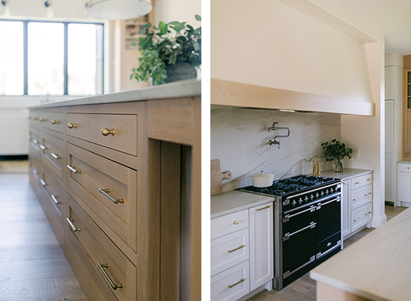
For contrast, the designers used a mix of cabinetry, black-trimmed windows and metal finishes. “I love the effortless look of mixing metals,” Rolling says. “For anyone nervous to try, I always recommend sticking with two. I mixed brushed nickel, black and warm brass.”
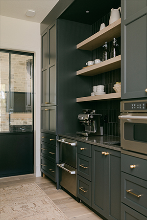
Perhaps the surprise in the home is the masculine coffee station (or “back kitchen”) tucked behind the primary space. It houses a majority of food storage, although cabinetry is ample throughout.
Tips
Painted off-white cabinets, a dark charcoal in the pantry, and the light-stained white oak island and hutch pieces set a casual modern farmhouse look in this Polk City home. The countertops are a honed quartzite.
“I love a neutral home,” says Jill Rolling of Black Birch Design and Build. “Warm whites, wood tones with pops of black accents repeat throughout.”
Tile Style
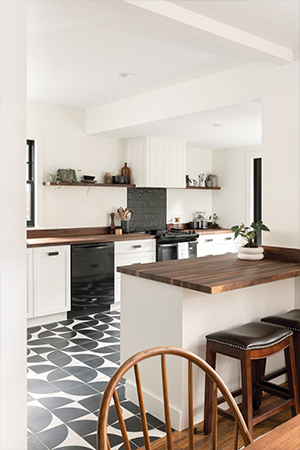
Located in a 1908 Woodland Heights home, this renovated kitchen is a perfect juxtaposition of modern and classic, new and old. The renovation focused on opening up the space, which was dark and cramped, says architect Anna Squier of Modern Studio, who worked with MBG Renovation on the project.
“By creating a modern space, we hoped to respect the historic elements of the home, rather than compete with them,” she says of the 193-square-foot space.
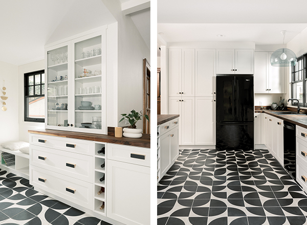
The centerpiece is the tile used on the floor and behind the cooktop. From Clé, the cement floor tiles are applied randomly, looking like an art installation. Sleek black tile backs the cooktop.
To create a modern galley layout, Squier used white Shaker-style cabinetry, which contrasts with the black trim on the new window and doors. The walnut butcher-block countertops complement the home’s intricate oak woodwork.
“Knowing that we wanted to go bold with the floors, we kept the remainder of the space white, bright and neutral,” Squier says. “The tile design influenced the rest of the space.”
Tips
“Black is bold, but also elegant and refined,” says architect Anna Squier. “Balance the black with some bright elements. In our case, lots of white.”
The design team originally wanted to use a dark grout to hide wear and tear. Squier suggests a lighter grout if using concrete tiles, as black can stain.
Contrast and Character
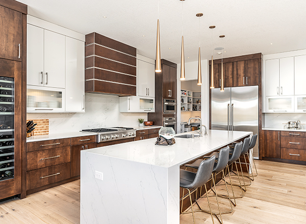
High-end details and a mix of materials create modern sophistication in this Ankeny kitchen by Kimberley Development.
With the dining room to the side and the living area opposite the island, the open space has an easy flow for entertaining, cooking or just relaxing.
Stained wood with a chrome U-channel contributes furniture-like detail to the range hood and island; the design motif repeats elsewhere in the home. The cherry finish also clads a built-in wine cooler, which the homeowner appreciates for entertaining or relaxing while making dinner.
Lighting is a hallmark of Kimberley’s designs, as are separate pantries. “Walk-in pantries are a must as far as I am concerned for a chef’s kitchen,” Kimberley says. “This allows you to easily see all of your food … without taking up your cabinet space.”
Tips
The waterfall island is wrapped in quartz, which developer Bill Kimberley prefers for its durability—it’s hard, dense and doesn’t absorb food, stains or bacteria.
The linear range hood repeats the cabinetry hardware. Pendants complement the task lighting, keeping the space bright even at night. Kimberley suggests putting all fixtures on dimmers for flexibility.


