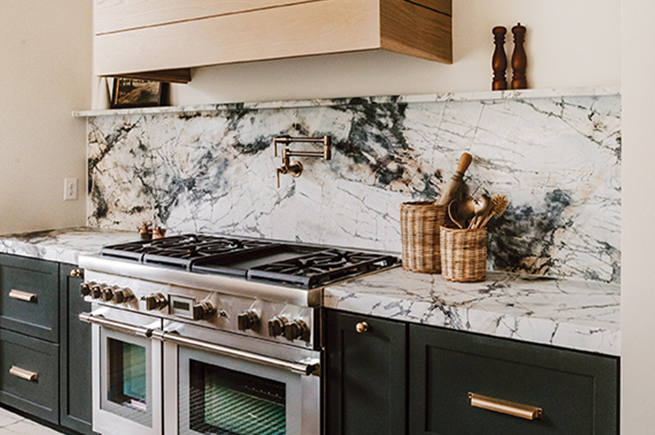
A mix of warm woods contrasts with the cool marble countertops, backsplash and narrow ledge in this Ankeny kitchen by Black Birch Homes. Photographer: Brooke Pavel Photography.
Writer: Candace Ord Manroe
Modern Ease
Designer Jill Rolling of Black Birch Homes embraced the idea of edgy ease as her true north in this kitchen design for an Ankeny custom home. Every design decision, including palette, materials, scale and detail, contributes to the aesthetic.
Rolling diluted the purity of a modern black-and-white palette with infusions of warm light brown. Lower slate-finish cabinets are topped with “invisible blue” marble that reads white but has a lively veining for interest.
The white walls get a friendly pat on the back with tan wood slabs—modernly sleek but warm in tone—that serve as open cabinets. A modern marble-top island is illuminated with neutral metal lighting. And cleverly, a state-of-the-art range wall is hooded with a simple wooden geometric design that’s contemporary in form but warm in nature.
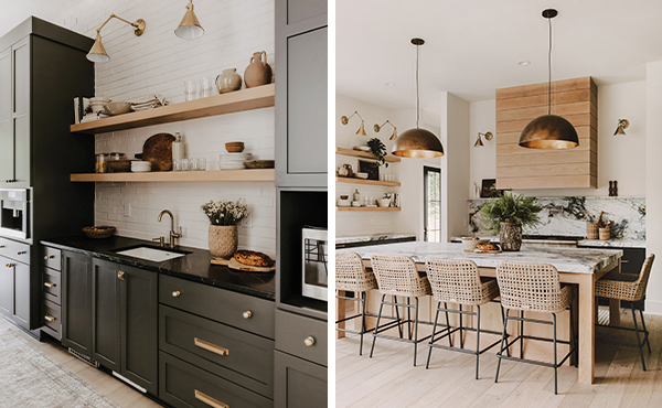
Photographer: Brooke Pavel Photography
Tips:
Go bold and paint a brick wall white to create the right balance for a light livability.
“When using a dark cabinet color, use minimal upper cabinets” to keep the room from feeling too heavy, recommends designer Jill Rolling with Black Birch Homes.
Introduce a light brown wood like white oak to add warmth to a modern kitchen.
Rooted In Iowa
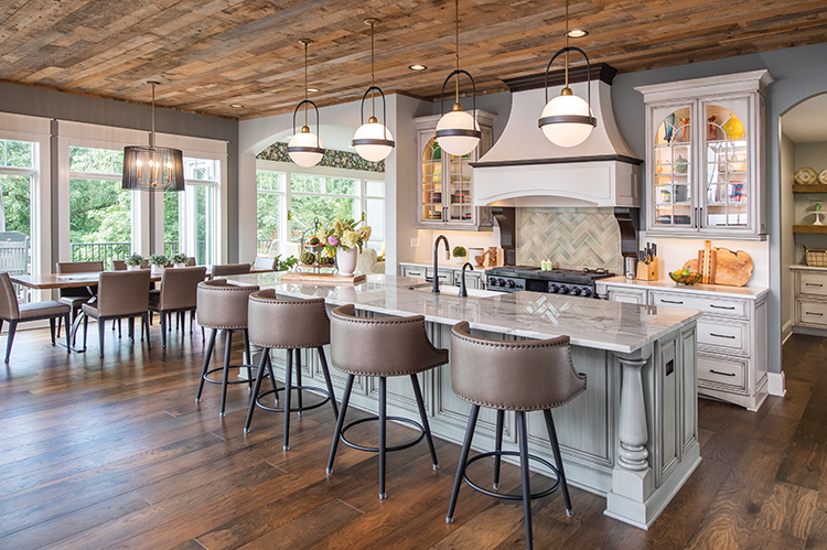
For fans of French country design, the kitchen of a 10,000-square-foot Adel home designed by Hal Davis offers swoonable moments. Located in Heritage Woods, the home’s 10-foot-high ceilings throughout needed color and texture, especially in the kitchen, where modernity and sleek surfaces typically prevail. But look up. A reclaimed mixed-wood ceiling exudes Old World charm. It’s actually a variety of reclaimed wood from Iowa, which reflects both the designer’s and the homeowners’ desire to “live local.” To balance the ceiling, Davis had oak flooring laid in the opposte direction for visual contrast.
The cooking wall is the piece de resistance for the country-French feel. Davis started with a dramatic curved hood made of Venetian plaster. Curved glass cabinets add sparkle and romance. A custom backsplash behind the stove is laid in a herringbone pattern, which is popular in European design.
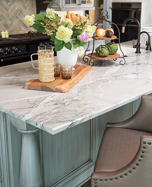
Designer Hal Davis relied on traditional touches such as turned legs, detailed molding and leather with nailheads to create a classic look in this new Adel home. Photographer: Duane Tinkey.
Tips:
Repeat elements to drive home the look. “I repeated the curve of the glass cabinets with a small bow in the island,” says designer Hal Davis.
Go for a light brush of romance by finishing solid maple perimeter cabinets with a pearl finish and brushed sepia.
Lighten up a large island with a bit of color. Davis chose a color called “rain” brushed with sepia from CKF in Urbandale.
Shop local for reclaimed goods to get a country European look. This ceiling includes pine, oak and cedar repurposed from old barns and other Iowa sources.
Photographer: Golden Photos
Entertaining Oasis
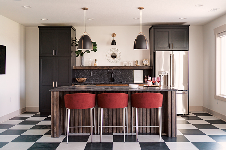
Face it. Most downstairs at-home bars have close to zero crowd appeal. Unless there’s a hot game on the big-screen, why bother? That said, designer Jessica Lemmo with ALT Design Studio determined to flip the script. The downstairs bar she designed for an Ankeny show home is such a warm, friendly space it might create the opposite challenge: getting guests to go home.
“The rest of the house is Craftsman, so we wanted this space to feel a little different and made it more art deco,” Lemmo says. “We still wanted a vintage vibe but with a distinction.” Black-and-white tile flooring around the bar does just that. Little things, such as adding a 1×2-inch wood trim above the black granite backsplash for decorative storage, makes this bar a destination.
Tips:
Think outside the box with your bar design. Create a look different enough from the rest of the house that it makes a statement, but keep it connected through the color palette and materials. Here, the bright color of the barstools relates to the upstairs color scheme.
Pay attention to texture. Lemmo chose a black backsplash with texture that calls for a closer look.
Ensure interest with organic elements like the wood boards covering the island.
Create continuity with lighting. The pair of pendants over the island keeps the eye flowing easily with a matching smaller-scale pendant.

